
已服务 10 万 + 用户


Bytedance SSO
先进的开发者体验
开箱即用的底层能力支持,为开发者节省精力,避免重造
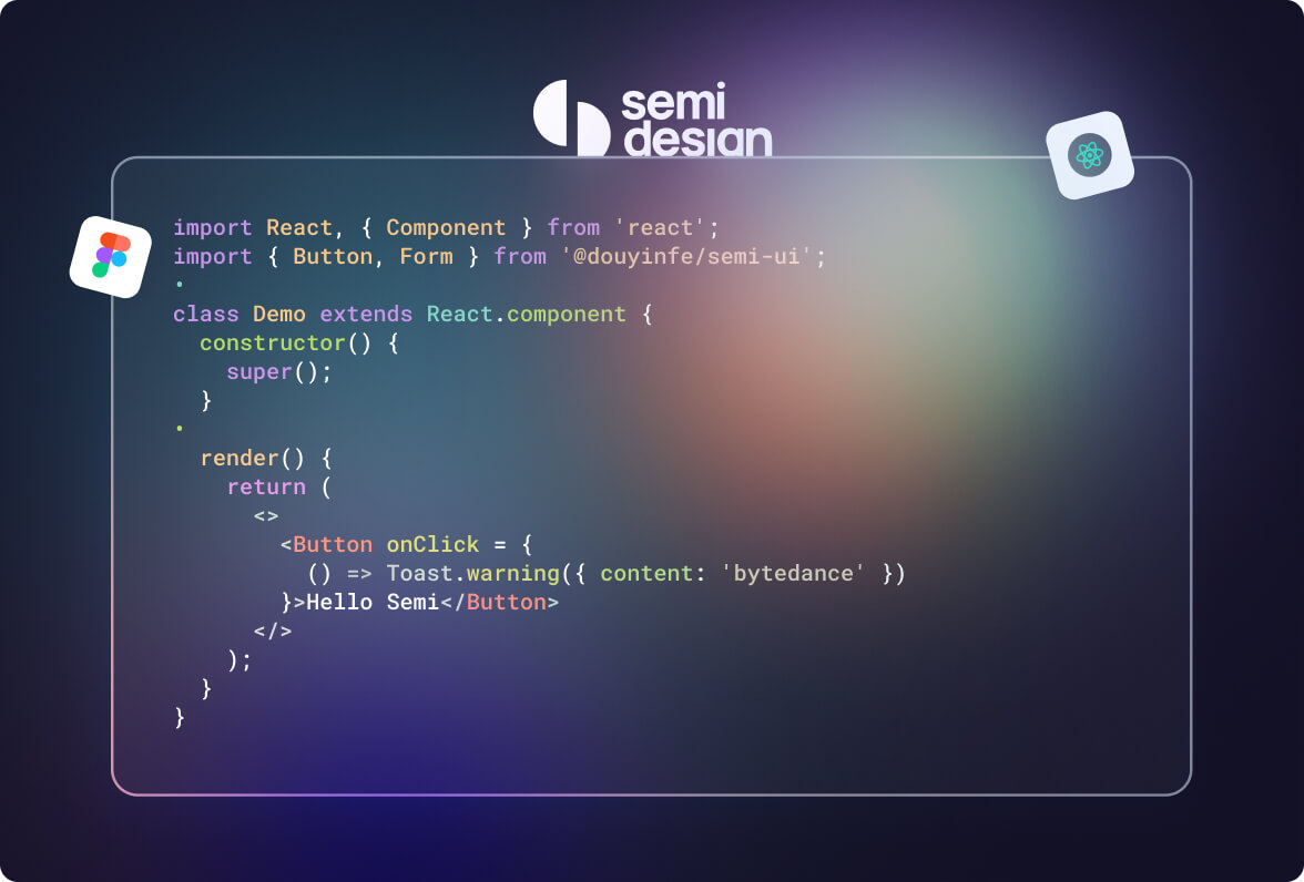
设计稿转代码
Semi 提供高效的 design to code 能力,3-5s,一键点击,从 Figma 设计稿生成真实代码
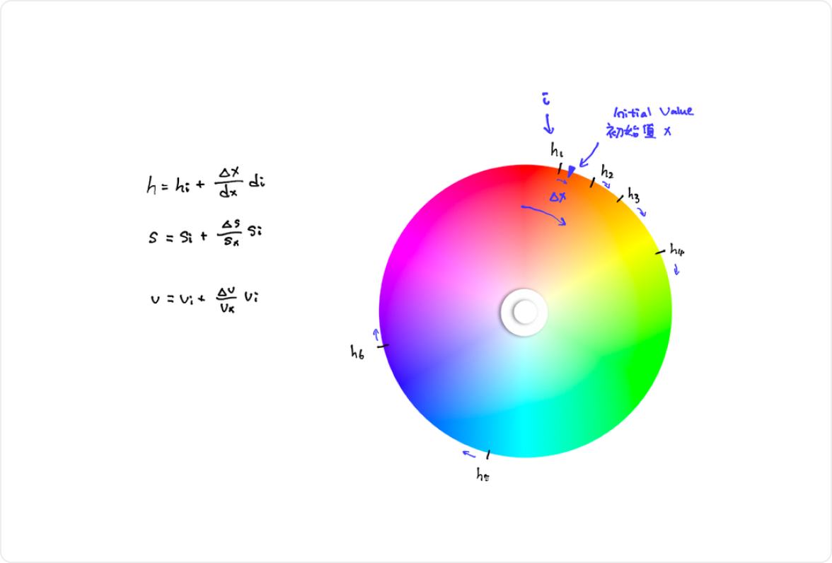
A11y 无障碍友好
Semi 遵循 W3C 标准为所有组件提供键盘交互、焦点管理和语义化支持
国际化与多语言
Semi 提供完备的多语言、多时区、RTL 支持,助你轻松打造全球化应用
Live Code 组件
LiveCode 允许你使用在线代码编辑器即时演示你的 UI 组件
稳定的质量保障
Semi 稳定迭代 5 年+,使用了单元测试、E2E 测试、视觉对比测试等多种方法保证组件的稳定和质量,测试覆盖率达到 90%
支持 SSR
Semi 组件库支持 SSR 场景,可以在 Next.js、Gatsby 和 Remix 等框架中使用
易于贡献的 FA 架构
Semi 基于 FA 架构设计,主逻辑抽象为 Foundation 包,源码清晰易读,易于迁移到其他框架
轻松兼容 web components
提供完整的适配方案,所有的组件在 shadow DOM 中均可正常工作,更适合用于构建 SDK、浏览器插件等需要 DOM 隔离的场景
百变主题
提供高达 3000+ Design Token,快速克隆或深度定制,灵活调配符合品牌调性的设计风格

Semi Design 默认
飞书 Universe Design 主题
抖音创作服务主题

剪映主题

火山引擎主题

Richard Hendricks
@RichardHendricks视频压缩算法
私信管理
| Apple 账号 | richard@icloud.com |
|---|---|
| Google 账号 | richard@gmail.com |
| richard_aaa | |
| Richard Hendricks |
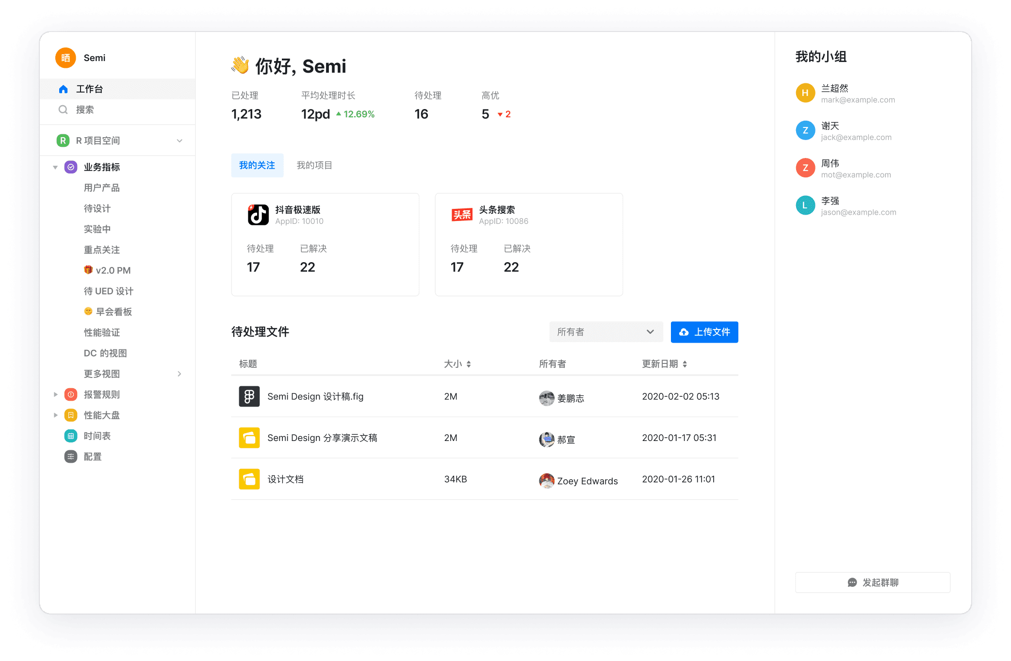
| 发信人 | 私信内容 | 发信时间 |
|---|---|---|
| 系统通知 | #Semi Design2Code# 技术分享开讲啦!根据活动规则,恭喜 13 位... | 2020-02-02 05:13 |
| 系统通知 | Semi Design 分享演示文稿 | 2020-01-17 05:31 |
| 系统通知 | 设计 | 2020-01-26 11:01 |
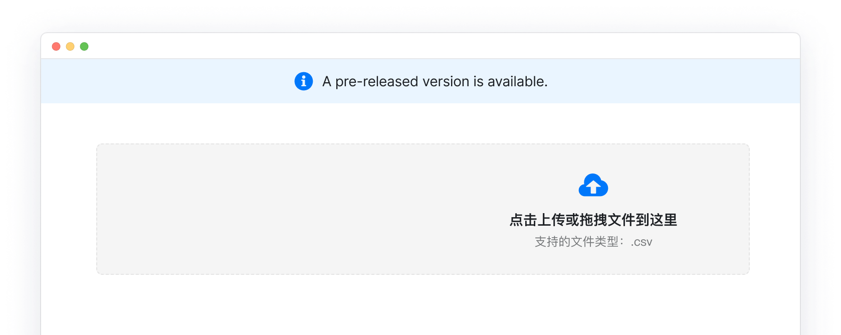
让设计与代码同源
使用真实组件设计,前端代码一键转
上传报告
文档中文名
*
文档英文名
文档链接
*
报告标签
结论
备注

打造现代 Web 应用
使用 Semi 与现代操作系统、浏览器更贴近的设计语言
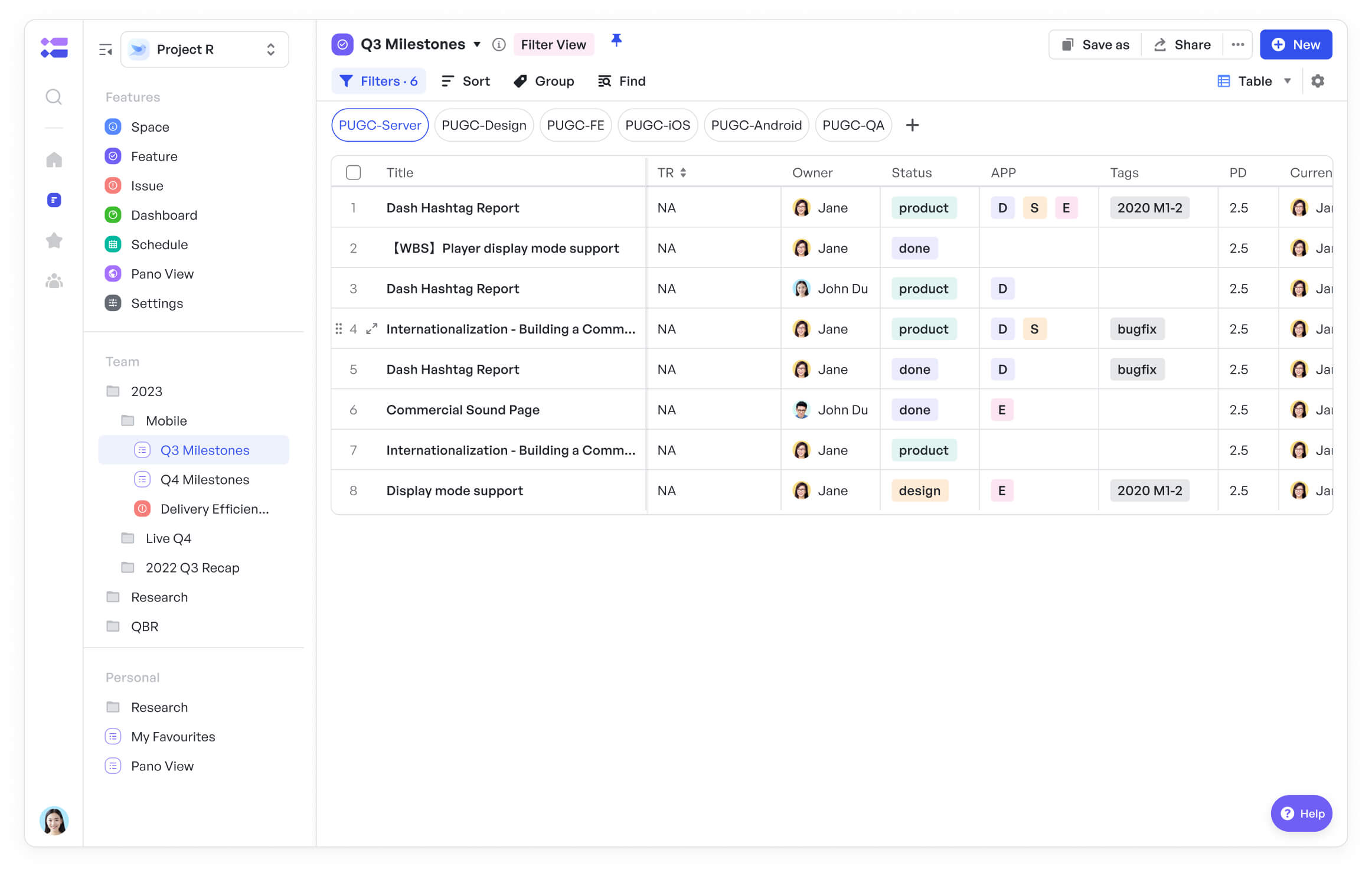
飞书项目
飞书项目是 2022 年春季飞书发布的单品,支持大型团队将复杂项目拆解流程并可视化,直观呈现协作标准,让成员明晰权责,轻松掌握上下游信息。
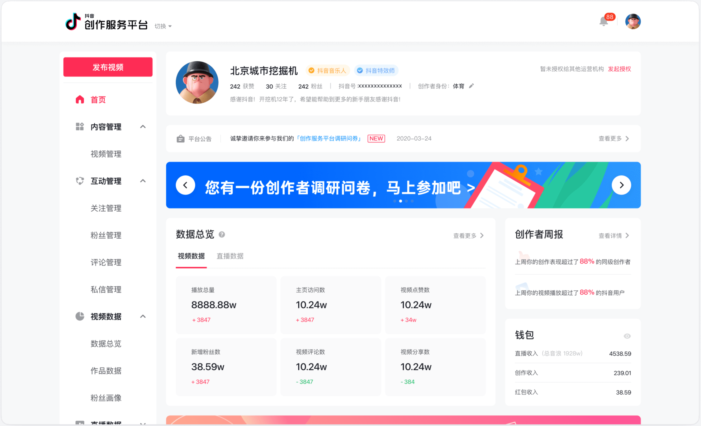

抖音创作服务平台是抖音创作者的专属服务平台,支持用户作为创作者和管理机构两种登录方式,提供多种功能助力用户高效运营
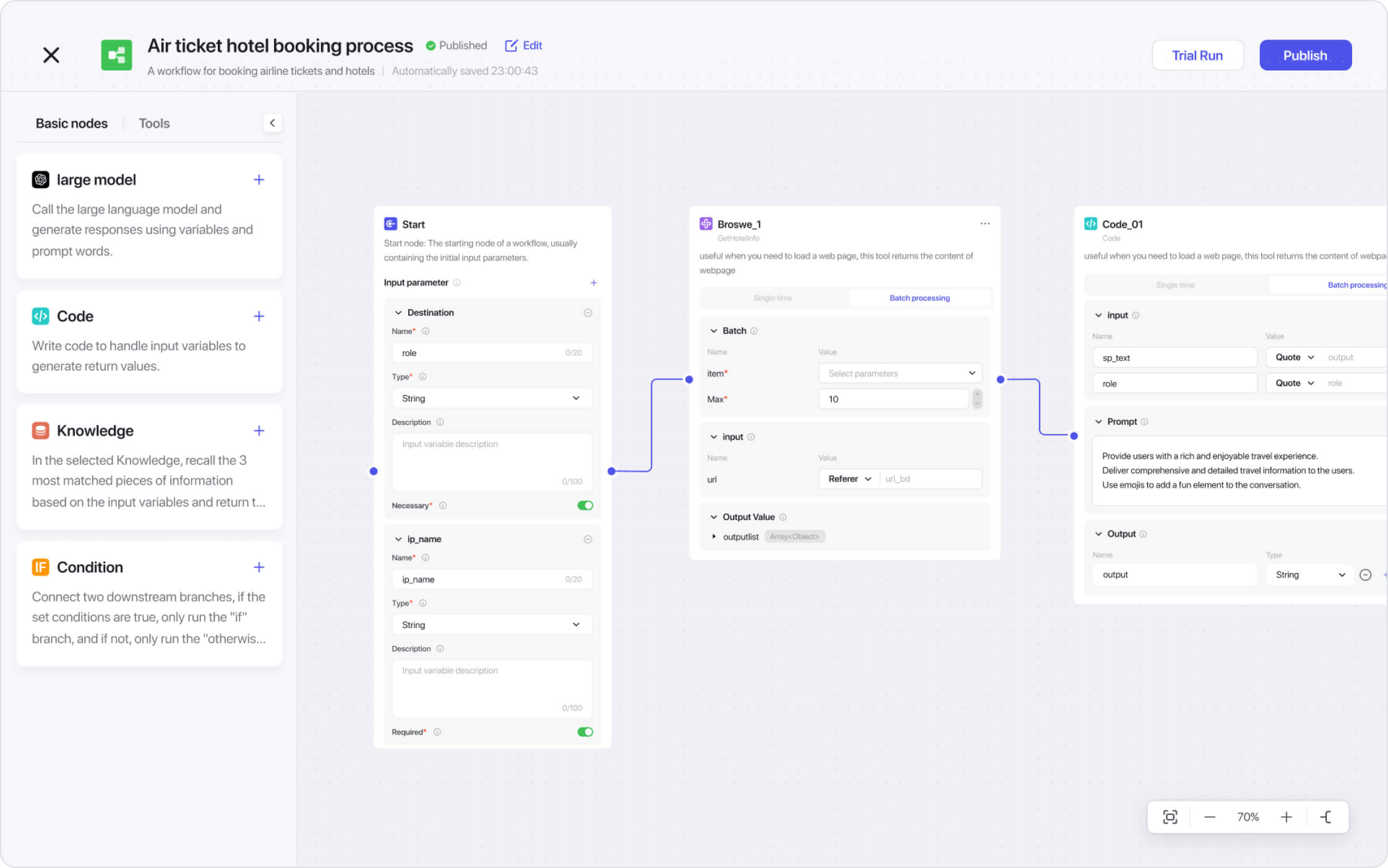
新一代一站式 AI Bot 开发平台,无论你是否有编程基础,都可以在扣子平台上快速搭建基于 AI 模型的各类问答 Bot,发布到豆包、飞书、微信客服、微信公众号多个渠道,与更多人一起玩转 AI。
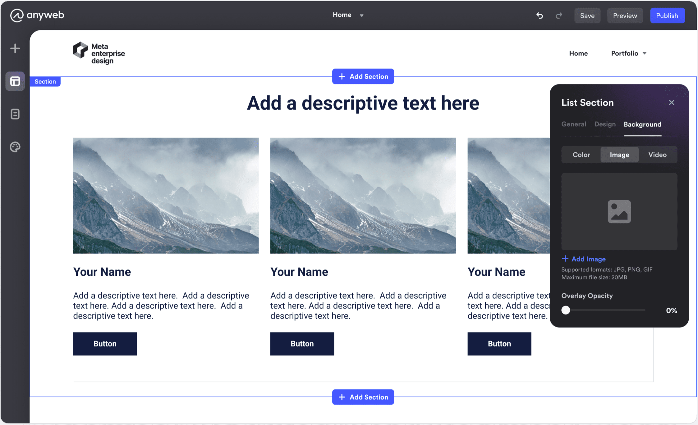
Anyweb 是一个免费的网站构建器,可以轻松创建专业网站。无需编程技能,您可以通过 Anyweb 拖放编辑器快速轻松地设置自定义网站。
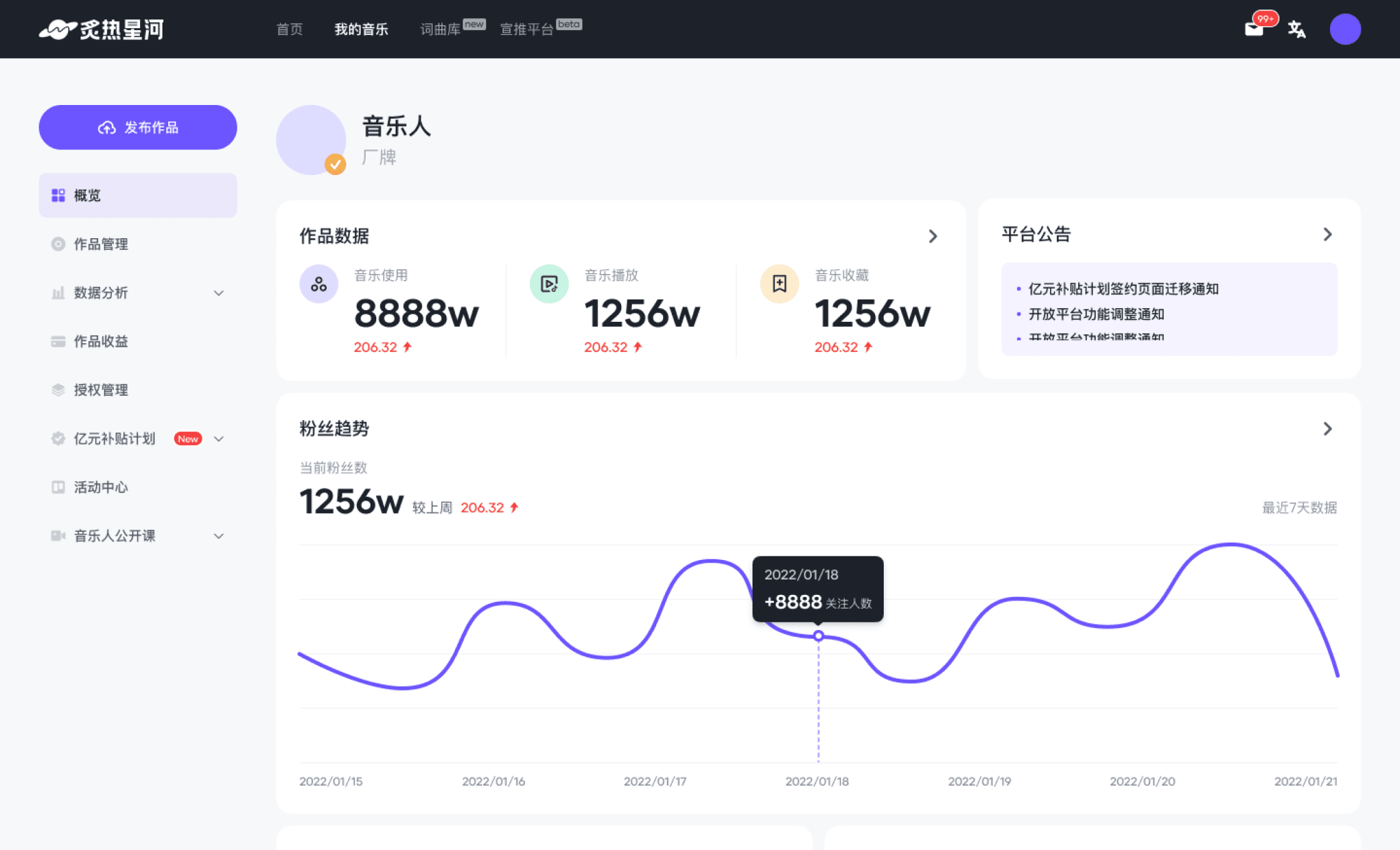
炙热星河是抖音旗下一站式音乐人服务平台,在音乐的·浩瀚星河,让有温度的音乐创作人入驻,为优秀音乐作品创造价值。
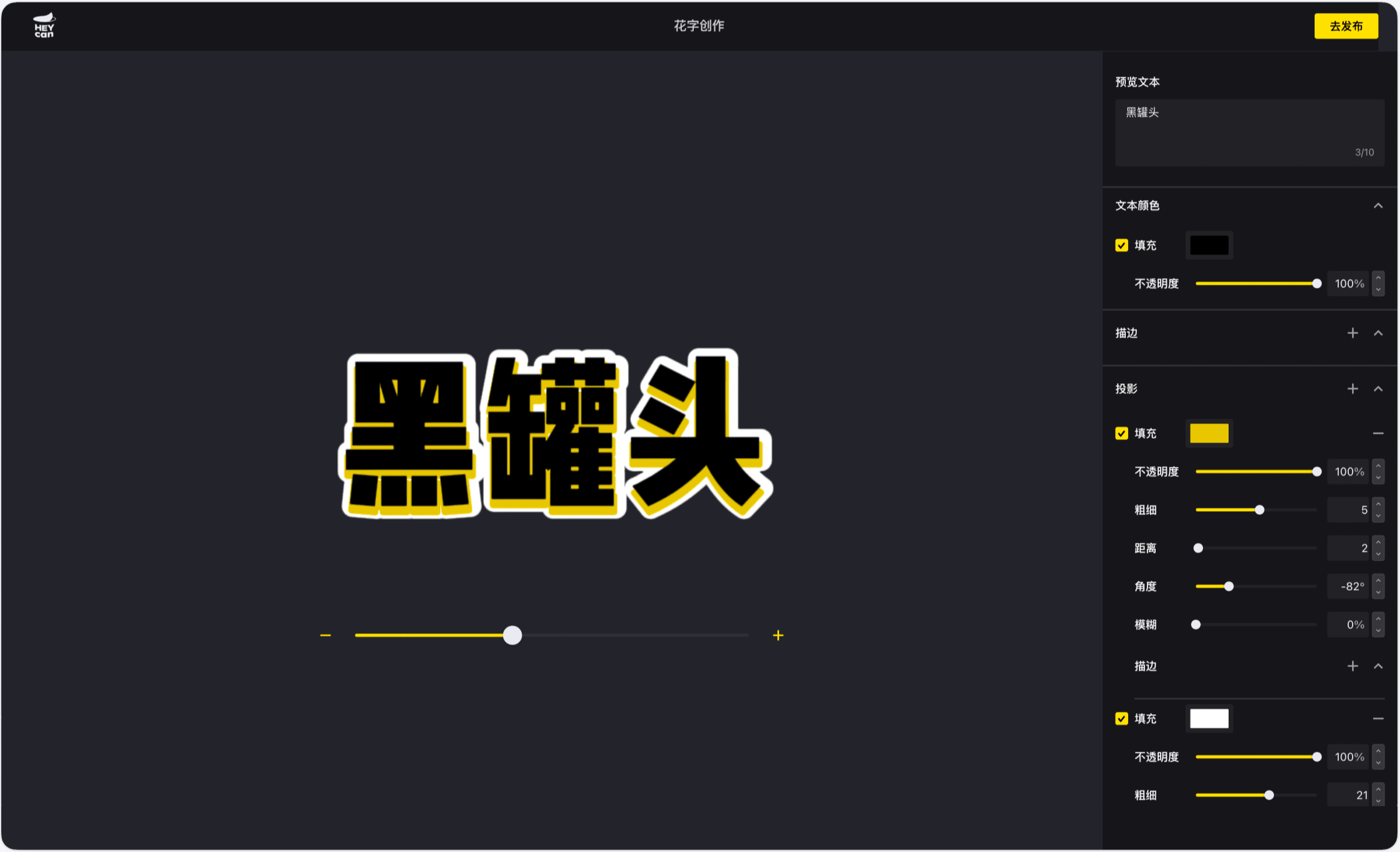
剪映黑罐头连接视频创作产业链中的所有参与者,构建素材库(模板、道具、音效、花字、特效等),提供素材分享、合作交流、商业变现等服务。
内容深度解读
了解我们在无障碍、主题定制、自动化方案背后的思考
Semi Design 中的无障碍设计
「不支持 Accessibility 的前端开源 UI 组件库,就是灾难」
深入浅出 Semi 主题化方案
兼容多元的品牌语言和产品形态,避免无意义的重造
Semi Design 如何做质量保障
综合运用 Unit Test、E2E Test、Visual Test 保障组件库稳定性
Semi D2C 设计转代码的演进之路
用先进的工具连接设计师与开发者
字节跳动开源 OpenDay 主题分享
D2C 设计稿转代码深度解读
与用户共同成长
Semi Design 重视我们的用户,加入并助力我们不断完善
Stars
0+
Fork
0+
下载
0+
贡献者
0+
特别鸣谢


接入简单易上手;Semi UI 样式美观,主题统一;API 丰富全面。
@Mengzhou
前端,字节跳动
C
Semi 组件挺全的,覆盖的比较广泛,整体风格也不错。
@Changyi
前端,字节跳动
M
设计资源对提效有明显帮助。
@Miaomiao
设计,字节跳动
Y
Semi 有很多公司内的其他业务使用,有比较多的样例参考,我们依托 Semi 的组件设计,参考其他业务平台的设计方案,总结了自己的前端规范,统一平台的交付标准。
@Yinfeng
产品经理,字节跳动
Semi 超级好用!强推。
@Dingwei
前端,字节跳动
Semi 作为对标业界优秀的 UI 库来说做的确实很不错了,对于问题的响应速度,问题的解决效率都有很好的保障。
@Jingyu
前端,字节跳动
Semi Design 使用方便,样式美观。
@Yucang
前端,字节跳动
G
Semi 统一的样式,高保真的原型便于与前端同学进行沟通。
@Guangye
产品经理,字节跳动
文档非常详细,对组件的细节思考非常充足。
@Baifu
前端,字节跳动