Input · DatePicker
DatePicker
The date selector is used to help the user select a compliant, formatted date (time) or date (time) range.
Demos
How to import
Basic Use
Picker Density
The density can be used to control the size of the picker panel. The
compact is the small size and the default is the default size. Support after v1.17.0.Multiple Date Selection
Set
Multiple to true, can choose multiple dates.Date and Time Selection
Set
Starting from version V2.22.0, we changed the default mode of ScrollItem in TimePicker from wheel to normal. If you want to apply the infinite scrolling effect again, you can enable it by passing in a specific configuration through timePickerOpts.
type to dateTime, can choose date and time.Starting from version V2.22.0, we changed the default mode of ScrollItem in TimePicker from wheel to normal. If you want to apply the infinite scrolling effect again, you can enable it by passing in a specific configuration through timePickerOpts.
Date Range Selection
Set
type to dateRange, can choose the date range.Note
When you use range selection, if only one date is selected, onChange will not be triggered at this time. Only when both the start date and the end date are selected will onChange be triggered.
Date Time Range Selection
Set
type to dateTimeRange, can choose the date range and choose time;Input in Panel
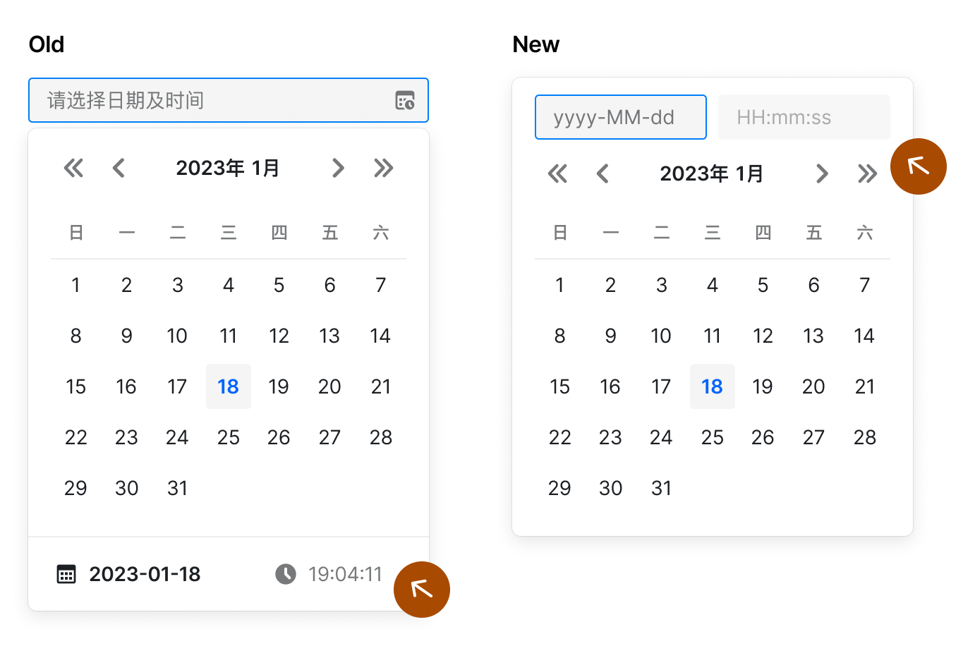
Use
insetInput to control whether the date panel is inset with the input box, the default is false. Supported since v2.7.0. Inset input boxes are suitable for the following scenarios:- Date and time selection, you can directly input the time through the embedded input box, no need to select the time through the scroll wheel
- When
triggerRender+ range selection, use the inset input box to modify the start and end dates independently
After
insetInput is turned on, it includes the following functions:- After clicking the trigger, the panel will pop up in the original position by default. You can customize the popup position by
position - Click the embedded date input box, the panel switches to date selection; click the embedded time input box, the panel switches to time selection
- Consistent with the external input box, if an illegal date is entered, the date will return to the previous legal date after the panel is closed
Notes
Note that some adjustments and restrictions will be made to the components after opening insetInput:
- Trigger style: the trigger is read-only when the panel is not open, and the trigger is disabled when it is open
- Panel style: when type includes time, hide the toggle button at the bottom
- After insetInput is enabled, the
formatAPI only supports thedateFormat[ timeFormat]format. Using other formats will affect the display of the inset input box placeholder and trigger text
Synchronously switch months
version:>= 1.28.0
In the scenario of range selection, turning on
syncSwitchMonth means to switch the two panels simultaneously. The default is false.Note: Clicking the year button will also switch the two panels synchronously. Switching the year and month from the scroll wheel will not switch the panels synchronously. This ensures the user's ability to select months at non-fixed intervals.
Panel Change Callback
version:>=1.28.0
onPanelChange will be called when the month or year of the panel is changed.Select Week
daterange is used with startDateOffset and endDateOffset to select range with single click, such as weekly selection and biweekly selection. Support after v1.10.0.Selection
Version: > = 0.21.0
Set
type to month, can make year-to-month selection.Year and Month Range Selection
version: >= 2.32.0
Set
type to monthRange to select the year and month range, small size and quick panel are not supported yet.Confirm Date and Time Selection
Version: > = 0.18.0
For the selection of "datetime" (type = "dateTime") or "datetime range" (type = "dateTimeRange"), you can confirm it before writing the value into the input box. You can pass
NeedConfirm = true to enable this behavior.At the same time, the click callbacks of the "onConfirm" and "onCancel" buttons are supported.
The following example binds three callbacks:
onChange, onConfirm and onCancel, and you can open the console to see the difference in print information.Note: When openingneedConfirm, you need to click the cancel button to close the panel, and clicking the blank area will no longer close the panel (v2.2.0)
Date and Time Selection with Shortcuts
Pass parameter
Presets to set shortcuts for date selection.Render TopSlot/BottomSlot
With
topSlot and bottomSlot, you can customize the rendering of the top and bottom extra areas.Disable Date Selection
Disable Partial Date or Time
Pass in
disabledDate to disable the specified date, pass in disabledTime to disable the specified time, and with defaultPickerValue you can specify the year and month when the panel is opened.disabledDate anddisabledTime, the accepted input parameters are the current date, the former returns a boolean value, the latter returns an object It will be directly passed to the TimePicker component.Note
When you use timeZone, the Date of the first parameter is the time under the time zone you choose (similar to the first return value of onChange)
When
type contains range, the date can be disabled dynamically according to the rangeStart. The options parameter is supported after 1.9.0When
type contains range, dates can be disabled based on the focus state. The focus state is passed through the rangeInputFocus parameter in options.Custom Display Format
Pass parameter
format to custom display format.Custom Trigger
Version: >=0.34.0
By default we use the
Input component as the trigger for the DatePicker component. You can customize this trigger by passing the triggerRender method.The custom trigger is a complete customization of the trigger, the default clear button will not take effect, if you need clear function, please customize a clear button.
Note
When DatePicker is range type, the default date selected after the panel is opened is the start date, and it will switch to the end date selection after selection. The focus is reset when the panel is closed.
We recommend providing a clear button, when you pass null value to DatePicker, DatePicker will also reset focus internally. This allows the user to reselect the date range after clearing. (from v2.15)
Custom Render Date Content
Version:>=1.4.0
renderDate: (dayNumber: number, fullDate: string) => ReactNodedayNumber: such as13.fullDate: such as2020-08-13.
Custom Render Date Box
Version:>=1.4.0
renderFullDate: (dayNumber: number, fullDate: string, dayStatus: object) => ReactNodedayStatus is this status of current date box. The included keys are as follows.API Reference
| Properties | Instructions | Type | Default | Version |
|---|---|---|---|---|
| autoAdjustOverflow | Whether the floating layer automatically adjusts its direction when it is blocked | boolean | true | 0.34.0 |
| autoFocus | Automatic access to focus | boolean | false | 1.10.0 |
| autoSwitchDate | When the year and month are changed through the left and right buttons and the drop-down menu at the top of the panel, the date is automatically switched. Only valid for date type. | boolean | true | 1.13.0 |
| bottomSlot | Render the bottom extra area | ReactNode | 1.22.0 | |
| borderless | borderless mode >=2.33.0 | boolean | ||
| className | Class name | string | - | |
| clearIcon | Can be used to customize the clear button, valid when showClear is true | ReactNode | 2.25.0 | |
| defaultOpen | Panel displays or hides by default | boolean | false | |
| defaultPickerValue | Default panel date | ValueType | ||
| defaultValue | Default value | ValueType | ||
| density | Density of picker panel, one of default, compact | string | default | 1.17.0 |
| disabled | Is it disabled? | boolean | false | |
| disabledDate | The date is prohibited from the judgment method, and the date is prohibited when returned to true. Options parameter supported after 1.9.0, rangeEnd supported after 1.29 and rangeInputFocus is supported since 2.22 | (date, options) => boolean | () = > false | |
| disabledTime | Time prohibition configuration, the return value will be transparently passed to TimePicker as a parameter | (date, panelType) => object | () => false | 0.36.0 |
| disabledTimePicker | Disable time selection or not. | boolean | 0.32.0 | |
| dropdownClassName | CSS classname for drop-down menu | string | 1.13.0 | |
| dropdownMargin | Popup layer calculates the size of the safe area when the current direction overflows, used in scenes covered by fixed elements, more detail refer to issue#549, same as Tooltip margin | object|number | 2.25.0 | |
| dropdownStyle | Inline style of drop-down menu | object | 1.13.0 | |
| endDateOffset | When type is dateRange, set the end date of the selected range | (selectedDate?: Date) => Date; | - | 1.10.0 |
| format | Date string format displayed in the input box | string | Corresponding to type: For details, see Date and Time Format | |
| getPopupContainer | Specifies the parent DOM, and the bullet layer will be rendered to the DOM, you need to set 'position: relative` This will change the DOM tree position, but not the view's rendering position. | function():HTMLElement | () = > document.body | |
| inputReadOnly | Is the text box readonly | boolean | false | |
| insetInput | Whether the input box is embedded in the panel. InsetInputProps type supported after v2.29 | boolean | InsetInputProps | false | 2.7.0 |
| inputStyle | Input box style | object | ||
| max | When multiple is set to true, the number of selected, non-pass or value is null|undefined, unlimited. | number | - | |
| multiple | Whether you can choose multiple, only type = "date" is supported | boolean | false | |
| needConfirm | Do you need to "confirm selection", only type= "dateTime"\| "dateTimeRange" works. | boolean | 0.18.0 | |
| open | Controlled properties displayed or hidden by panels | boolean | ||
| placeholder | Input box prompts text | string|string[] | 'Select date' | |
| position | Floating layer position, optional value with Popover #API Reference · position | string | 'bottomLeft' | |
| prefix | Prefix content | string|ReactNode | ||
| presets | Date Time Shortcut, start and end support function type after v2.52 | Array | [] | |
| preventScroll | Indicates whether the browser should scroll the document to display the newly focused element, acting on the focus method inside the component, excluding the component passed in by the user | boolean | ||
| presetPosition | Date time shortcut panel position, optional 'left', 'right', 'top', 'bottom' | 'bottom' | 2.18.0 | |
| rangeSeparator | Custom range type picker separator of input trigger | string | '~' | 1.31.0 |
| rangeSeparatorNode | Custom separator render node between range inputs (only affects UI render, string parsing still uses rangeSeparator) | ReactNode | - | |
| renderDate | Custom date display content | (dayNumber, fullDate) => ReactNode | - | 1.4.0 |
| renderFullDate | Custom display date box | (dayNumber, fullDate, dayStatus) => ReactNode | - | 1.4.0 |
| showClear | Do you show the clear button? | boolean | true | 0.35.0 |
| size | Size, optional: "small," "default," "large" | string | 'default' | |
| spacing | The distance between the pop-up layer and the children element | number | 4 | 1.9.0 |
| startDateOffset | When type is dateRange, set the start date of the selected range | (selectedDate?: Date) => Date; | - | 1.10.0 |
| startYear | start year of the year scroll panel | number | 100 years before current year | 2.36.0 |
| endYear | end year of the year scroll panel | number | 100 years after current year | 2.36.0 |
| stopPropagation | Whether to prevent click events on the popup layer from bubbling | boolean | true | |
| syncSwitchMonth | In the scene of range, it supports synchronous switching of the month of the dual panel | boolean | false | 1.28.0 |
| timePickerOpts | For other parameters that can be transparently passed to the time selector, see TimePicker·API Reference | object | 1.1.0 | |
| topSlot | Render the top extra area | ReactNode | 1.22.0 | |
| triggerRender | Custom trigger rendering method | (TriggerRenderProps) => ReactNode | 0.34.0 | |
| type | Type, optional value: "date", "dateRange", "dateTime", "dateTimeRange", "month", "monthRange" | string | 'date' | |
| value | Controlled value | ValueType | ||
| weekStartsOn | Take the day of the week as the first day of the week, 0 for Sunday, 1 for Monday, and so on. | number | 0 | |
| onBlur | Callback when focus is lost. It is not recommended to use this API in range selection | (event) => void | () => {} | 1.0.0 |
| onCancel | Cancel the callback when selected, enter the reference as the value of the last confirmed selection, only type equals "dateTime"or "dateTimeRange" and needConfirm equals true | (date, dateString) => void | 0.18.0 | |
| onChange | A callback when the value changes | (date, dateString) => void | ||
| onClear | A callback when click the clear button | (event) => void | () => {} | 1.16.0 |
| onClickOutSide | When the pop-up layer is in a display state, click the non-popup layer and trigger callback, event parameter is supported since 2.68.0 | (event: React.mouseEvent) => void | () => {} | 2.31.0 |
| onConfirm | Confirm the callback at the time of selection, enter the reference as the value of the current selection, only type equals "dateTime" or "dateTimeRange" and needConfirm equals true | (date, dateString) => void | 0.18.0 | |
| onFocus | Callback when focus is obtained. It is not recommended to use this API in range selection | (event) => void | () => {} | 1.0.0 |
| onOpenChange | Callback when popup open or close | (isOpen) => void | ||
| onPanelChange | Callback when the year or date of the panel is switched | (date, dateStr) => void | 1.28.0 | |
| onPresetClick | Callback when click preset button | (item, e) => void | 1.24.0 | |
| yearAndMonthOpts | Other parameters that can be transparently passed to the year-month selector, see details in ScrollList#API | object | 2.22.0 |
Methods
| Methods | Description | Version |
|---|---|---|
| open | The dropdown can be manually opened when calling | 2.31.0 |
| close | The dropdown can be manually closed when calling | 2.31.0 |
| focus | The input box can be manually focused when called | 2.31.0 |
| blur | The input box can be manually blurred when called | 2.31.0 |
Interface Define
Accessibility
ARIA
- When a date is not selected, the
aria-labelof the trigger isChoose date, and when a date is selected, thearia-labelof the trigger isChange date - The role of the month in the date panel is
grid, the role of the week is set torow, and the date cell is set togridcell aria-disabledis true for the corresponding option when date and time are disabled- When multi-selected,
aria-multiselectableof month is true, andaria-selectedof date grid is true when selected - Some decorative icons in the panel, their
aria-hiddenis true
Date and Time Format
Adopted in the semi-ui component library date-fns(v2.9.0) As a date and time engine, formatting token means the following:
"y": Year"M": month"d": day"H": hours"h": hours (12h)"m": minutes"s": seconds
The following uses
new Date('2023-12-09 08:08:00') or [new Date('2023-12-09 08:08:00'), new Date('2023-12-10 10 :08:00')] as value to explain the impact of different types and different format values on the displayed value:| type | format | display value |
|---|---|---|
| date | yyyy-MM-dd | 2023-12-09 |
| dateTime | yyyy-MM-dd HH:mm:ss | 2023-12-09 08:08:00 |
| month | yyyy-MM | 2023-12 |
| dateRange | yyyy-MM-dd | 2023-12-09 ~ 2023-12-10 |
| dateTimeRange | yyyy-MM-dd HH:mm:ss | 2023-12-09 08:08 ~ 2023-12-10 10:08 |
Multiple dates or times are used by default
"," (English comma) separated.More token available Date-fns official website
Content Guidelines
- Date picker is recommended to be used with tags
- Use concise labels to indicate what the date selection refers to
- Please refer to Date and Time
Design Tokens
FAQ
- Date time picker, when you choose time, minute and second, you don't want to scroll infinitely. How to achieve the effect?
Starting from version V2.22.0, we changed the default mode of ScrollItem in TimePicker from wheel to normal. If you want to apply the infinite scrolling effect again, you can control this behavior through a specific switch in timePickerOpts, that is, timePickerOpts={{ scrollItemProps: { mode: "wheel", cycled: true } }}. - How to set the default display time when the panel is opened?
You can use the defaultPickerValue property. - Date time selection, range date selection, after inputting some dates, the panel does not echo the date?The input box needs to be entered completely before it is showed to the panel. For example, for
dateTimetype, the full requested date and time have been entered. FordateRangetype, full requires start and end dates to be entered. - What is the displayed time at the bottom of the date time selection panel?When no time is selected, it is the value of the time in
defaultPickerValue, if not set it is the time when the panel was opened. After selecting a time, it is the selected time.Since it has two hidden meanings in design, which may lead to ambiguity, it is recommended to use inline styles and open them throughinsetInput. It is recommended to read the relevant Documentation before use.