Start · Introduction
Introduction
Semi Design is a design system that defines a set of mid-back design and front-end basic components, helping us to more easily create a more consistent user experience.
What is Semi
Semi Design is a design system designed, developed and maintained by the Douyin front-end team and the MED product design team. As a comprehensive, easy-to-use, and high-quality modern enterprise-level application UI solution, it is refined from the complex scenes of Bytedance various business lines, supports nearly a thousand platform products, and serves 100,000+ internal and external users.
After nearly two years of iteration, Semi Design has become a cross-departmental infrastructure after various types of business landing verification, and has formed a rich tool chain and ecology around the component library. In order to allow the increasingly mature design system to serve more users and to further explore the usage scenarios, we decided to open source Semi and use the power of the community to continuously improve and expand the capability boundary.
After nearly two years of iteration, Semi Design has become a cross-departmental infrastructure after various types of business landing verification, and has formed a rich tool chain and ecology around the component library. In order to allow the increasingly mature design system to serve more users and to further explore the usage scenarios, we decided to open source Semi and use the power of the community to continuously improve and expand the capability boundary.
Our vision
Semi is mostly used in prefixes or phrases to mean "half"-just like a complete enterprise application, which usually consists of business logic and front-end interface, Semi Design hopes to become an indispensable half of this and provide a solid and high-quality front-end for enterprise applications The basics.
We believe that the real value of the design system lies in reducing the cost of front-end construction, while providing excellent design and engineering standards, fully liberating the productivity of designers and developers, so as to continuously incubate star products.
Design -- unchanged and changeable
In recent years, more and more SaaS products such as Slack, Notion, Figma have begun to rely on excellent user experience to drive growth. The evaluation criteria for products have gradually shifted from the purchaser to the end user; the quality of a product experience will directly affect whether the user continues to use it, and the experience design of the B-end product has become more and more important.
Semi Design is always committed to improving the experience of enterprise applications. By refining simple and lightweight, modern design style, meticulously polishing the interaction of atomic components, and iterating under the massive business scenarios of byte beating, a set of high-quality default foundations have been deposited-it will ensure the enterprise application products created by Semi , Born with a consistent "language" and a quality baseline that is significantly better than the old system.
In addition, a good design system must be "live", it needs to be able to develop and update with the growth of the business. Therefore, Semi has never tried to constrain users and solidify the so-called "unified specifications". Instead, on the basis of default, it fully implements modular decoupling and opens up customization capabilities to facilitate the secondary tailoring and customization of users, and the construction is suitable for different Front-end assets of morphological products.
Adhere to the high-quality and stable default foundation (unchanged), and fully open the flexibility of customization (variable) when needed, this is the unique design principle of Semi Design and will always follow.
Theming —— Brand one-click customization
How does Semi become flexible and changeable on the basis of coherence and unity? The answer is a powerful theming program.
By layering and sorting out thousands of design variables (Design Token), designers and developers can deeply customize the presentation layer at the global and even component level-even if you don’t know CSS, you can use the theme editor (DSM), to create a style that meets the diverse visual needs of the business and brand. Developers can publish and replace with one click through the npm package, which is easy to customize and easy to manage.
You can check Semi's official sample themes in different brand scenarios such as Douyin, Cut Ying, Feishu, Volcano Engine, etc. in Semi DSM
Within this year, we will also realize real-time synchronization of themes from online to design tools-while improving efficiency, we will further ensure the continuous alignment of design and R&D, and reduce the cost of communication between production and research.
Dark Mode
In order to be compatible with the preferences of more user groups in different production environments, as a supplement to the light color mode, any theme of Semi Design automatically supports the dark mode and can be dynamically switched when the application is running.
Not only that, Semi also allows users to enable dark mode in some areas of the app to be compatible with the use scenarios of SDK or plug-in products. Through advanced settings, users can also realize that the application and system themes are automatically consistent. At the same time, in order to further enhance the development experience, we also provide a cli tool for one-click compatibility of unstandardized stock old projects to Semi dark mode, avoiding migration costs in an automated way.
Not only that, Semi also allows users to enable dark mode in some areas of the app to be compatible with the use scenarios of SDK or plug-in products. Through advanced settings, users can also realize that the application and system themes are automatically consistent. At the same time, in order to further enhance the development experience, we also provide a cli tool for one-click compatibility of unstandardized stock old projects to Semi dark mode, avoiding migration costs in an automated way.
Foundation / Adapter
Semi Design adopts a set of cross web framework technical solutions, F/A layered design, splits the JavaScript of each component into two parts: Foundation and Adapter, which allows us to reuse Foundation code across frameworks by re-implementing only the adapter , Such as React, Vue, Angular, Svelte or WebComponent, quickly build common component libraries on different platforms.
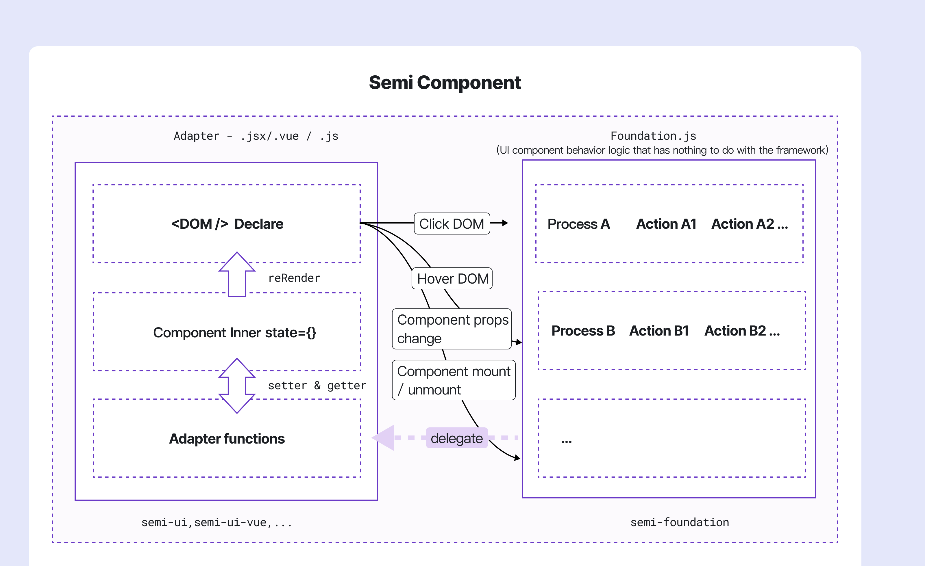
Foundation
Foundation contains the business logic that best represents the interaction of Semi Design components, and does not actually reference any DOM elements. Foundation delegates Adapter methods for any logic that requires DOM manipulation.
Adapter
Adapter is an interface that has all the methods required by Foundation to implement Semi Design business logic, and is responsible for
- Component DOM structure declaration
- Responsible for all DOM operation/update related logic, usually using framework APIs for setState, getState, addEventListener , RemoveListener and other operations.
Adapters can have many implementations, allowing interoperability with different frameworks.
At present, we have implemented the React version of Adapter. You can use our React components directly by
npm install @douyinfe/semi-ui. If you are interested in Semi's architecture design, you can read this article for more detail How to hierarchically design the UI component library so that it has the ability to adapt to multiple mvvm frameworks。
Internationalization - Diversity and compatibility
Under the practice of ByteDance globalization business, Semi Design has undergone 30+ version iterations and has perfect internationalization features-covering 10+ languages such as simplified/traditional Chinese, English, Japanese, Korean, Portuguese, etc., and date and time components are provided Global time zone support, all components can automatically adapt to the Arabic RTL layout.
At the same time, with the expansion of business, developers in all regions of the world have begun to use Semi to build applications. In order to better support the demands of these users, we have also adapted the site and documents bilingually to ensure barrier-free development.
At the same time, with the expansion of business, developers in all regions of the world have begun to use Semi to build applications. In order to better support the demands of these users, we have also adapted the site and documents bilingually to ensure barrier-free development.
Roadmap
In the future, Semi Design team will continue to improve and optimize the quality, and open more internal tool chains and resources to community users, including but not limited to:
Design to Code
For a long time, the Semi team has been trying to optimize daily work processes through various automated means, help team designers and R&D to improve efficiency, and even redefine traditional working methods. Among them, the "front-end page restoration" link has various inefficiencies such as time-consuming and high communication costs, which has always been the focus of our attention.
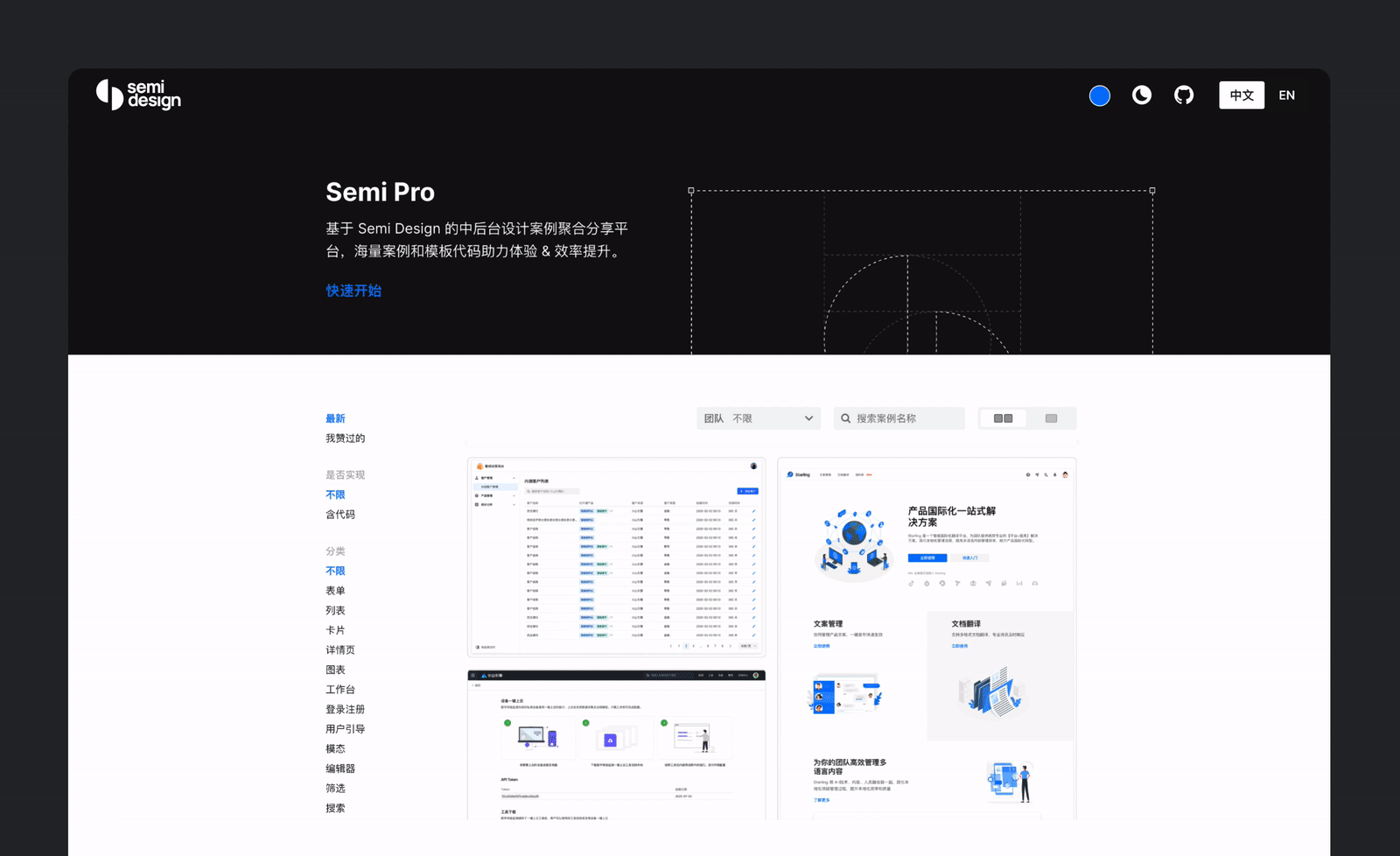
At present, we have implemented translation of static page design drafts, and have been effectively verified in scenarios such as landing pages, Form Page and Table page.In fact, homepage of our official website is developed with the help of this solution.
For the identification and translation of the component level in the design, we have implemented support through Code2Design + Design2Code. At present, we have covered 80% basic components. You can use Semi Figma Plugin for experience. Detailed tutorial can be found at https://semi.design/code/en-US/
In the future, combined with D2C tools, we can convert the page design templates accumulated by the team from massive business scenarios into code templates at low cost, and users will be able to quickly complete the cloning and structure restoration of front-end pages at a very low cost.
A11y
Semi attaches great importance to Web accessibility. Currently, we have implemented accessibility support for components in terms of semantic tags, theme color wheel algorithm contrast, and text perception.
The Accessibility chapter in each component document gives a detailed description of WAI-ARIA support and best practice recommendations. At the same time, we also provide keyboard event support and focus accessibility support for frequently used components.
However, since the improvement of barrier-free is a project with a large workload, we have not yet provided complete keyboard and focus barrier-free functions on all components. For more progress, please refer to A11y Issue
The Semi team will continue to pay attention to and improve the operability and perceptibility of components, and provide more convenient keyboard interaction and more complete barrier-free functions in addition to mouse-based operations in continuous iterations.
Cross WebFramework
High scalability, as Semi's core design principle, runs through Semi's code architecture design, API design, style layer abstraction and other aspects. Thanks to the Foundation/Adapter architecture design and the principle of layering style files, Semi is very easy to migrate to other front-end frameworks. In version 2.0, we rewrite Semi based on Typescript, hoping to still have a good development experience and quality assurance in the process of multi-frame migration and adaptation.
The Foundation layer (
@douyinfe/semi-foundation、@douyinfe/semi-theme-default) is also open source based on the MIT protocol, and we will always maintain the framework independence of its code implementation in future iterations. If you expect to bring Semi Design to more platform frameworks, we welcome you to reuse it directly. At this stage, our team will focus on the React system, but WebComponent is also one of the directions we focus on. The timing is right in the future, and we will make more attempts, so stay tuned.
Design Resources
- Designers can get palettes, style libraries and components from the Figma Component Library Semi Design System
Compatibility
- Modern browsers (Semi's dark mode/style file depends on css variable, the minimum version requirement is edge, ie11 and below are not supported)
 Edge |  Firefox |  Chrome |  Safari |  Opera |  Electron |
|---|---|---|---|---|---|
| last 2 versions | last 2 versions | last 2 versions | last 2 versions | last 2 versions | last 2 versions |