Demos How to import import { Button, SplitButtonGroup } from '@douyinfe/semi-ui';
Buttons support the following types:
Primary button ("primary", default) Secondary button ("secondary") Tertiary button ("tertiary") Warning button ("warning") Danger button ("danger") import React from 'react';
import { Button } from '@douyinfe/semi-ui';
function ButtonDemo() {
return (
<div className="btn-margin-right">
<Button>Primary Button</Button>
<Button type="secondary">Secondary Button</Button>
<Button type="tertiary">Tertiary Button</Button>
<Button type="warning">Warning Button</Button>
<Button type="danger">Danger Button</Button>
</div>
);
}
About the Font Color var(--semi-color-primary): mainvar(--semi-color-secondary): secondaryvar(--semi-color-tertiary): thirdvar(--semi-color-warning): warningvar(--semi-color-danger): dangerYou can define your elements directly using these theme colors.
import React from 'react';
function ButtonDemo() {
const types = [['primary', 'primary'], ['secondary', 'secondary'], ['tertiary', 'tertiary'], ['warning', 'warning'], ['danger', 'danger']];
return (
<article>
{types.map((type, index) => (
<strong key={index} style={{ color: `var(--semi-color-${Array.isArray(type) ? type[0] : type})`, marginRight: 10 }}>{Array.isArray(type) ? type[1]: type}</strong>
))}
</article>
);
}
The themes currently available are:
light: light backgroundsolid: dark backgroundborderless: no backgroundoutline: border modeThe default theme is light
Light Background import React from 'react';
import { Button } from '@douyinfe/semi-ui';
function ButtonDemo() {
const themes = [['light', 'light']];
const types = [['primary', 'primary'], ['secondary', 'secondary'], ['tertiary', 'tertiary'], ['warning', 'warning'], ['danger', 'danger']];
return (
<div>{
themes.map((theme, idxTheme) => (
<div key={idxTheme}>
<ul style={{ listStyle: 'none', display: 'flex', margin: 0, padding: 0 }}>
{types.map((type, idxType) => (
<li key={'' + idxTheme + idxType} style={{ margin: 10 }}>
<Button
theme={theme[0]}
type={type[0]}
>
{theme[1]} {type[1]}
</Button>
</li>)
)}
</ul>
</div>))
}
</div>
);
}
Dark Background import React from 'react';
import { Button } from '@douyinfe/semi-ui';
function ButtonDemo() {
const themes = [['solid', 'solid']];
const types = [['primary', 'primary'], ['secondary', 'secondary'], ['tertiary', 'tertiary'], ['warning', 'warning'], ['danger', 'danger']];
return (
<div>{
themes.map((theme, idxTheme) => (
<div key={idxTheme}>
<ul style={{ listStyle: 'none', display: 'flex', margin: 0, padding: 0 }}>
{types.map((type, idxType) => (
<li key={'' + idxTheme + idxType} style={{ margin: 10 }}>
<Button
theme={theme[0]}
type={type[0]}
>
{theme[1]} {type[1]}
</Button>
</li>)
)}
</ul>
</div>))
}
</div>
);
}
No Background import React from 'react';
import { Button } from '@douyinfe/semi-ui';
function ButtonDemo() {
const themes = [['borderless', 'borderless']];
const types = [['primary', 'primary'], ['secondary', 'secondary'], ['tertiary', 'tertiary'], ['warning', 'warning'], ['danger', 'danger']];
return (
<div>{
themes.map((theme, idxTheme) => (
<div key={idxTheme}>
<ul style={{ listStyle: 'none', display: 'flex', margin: 0, padding: 0 }}>
{types.map((type, idxType) => (
<li key={'' + idxTheme + idxType} style={{ margin: 10 }}>
<Button
theme={theme[0]}
type={type[0]}
>
{theme[1]} {type[1]}
</Button>
</li>)
)}
</ul>
</div>))
}
</div>
);
}
Border Mode import React from 'react';
import { Button } from '@douyinfe/semi-ui';
function ButtonDemo() {
const themes = [['outline', 'outline']];
const types = [['primary', 'primary'], ['secondary', 'secondary'], ['tertiary', 'tertiary'], ['warning', 'warning'], ['danger', 'danger']];
return (
<div>{
themes.map((theme, idxTheme) => (
<div key={idxTheme}>
<ul style={{ listStyle: 'none', display: 'flex', margin: 0, padding: 0 }}>
{types.map((type, idxType) => (
<li key={'' + idxTheme + idxType} style={{ margin: 10 }}>
<Button
theme={theme[0]}
type={type[0]}
>
{theme[1]} {type[1]}
</Button>
</li>)
)}
</ul>
</div>))
}
</div>
);
}
Size Three sizes are defined by default:
Big: "Large" Default: "default." Small: "Small" import React from 'react';
import { Button } from '@douyinfe/semi-ui';
function ButtonDemo() {
return (
<div>
<Button size='large' style={{ marginRight: 8 }}>large</Button>
<Button size='default' style={{ marginRight: 8 }}>default</Button>
<Button size='small'>small</Button>
</div>
);
}
The block button has a predefined width, and its width is independent of the width of the contents of the button.
import React from 'react';
import { Button } from '@douyinfe/semi-ui';
function ButtonDemo() {
return (
<div>
<Button block>block button</Button>
</div>
);
}
An icon that defines a button.
import React from 'react';
import { Button } from '@douyinfe/semi-ui';
import { IconCamera, IconSidebar, IconChevronDown } from '@douyinfe/semi-icons';
function ButtonDemo() {
return (
<div>
<strong>Default Status: </strong>
<Button icon={<IconCamera />} aria-label="Screenshot" />
<br/><br/>
<strong>Disabled Status:</strong>
<Button icon={<IconCamera />} aria-label="Screenshot"/>
<br/><br/>
<strong>With Type: </strong>
<span className="btn-margin-right">
<Button type="primary" icon={<IconCamera />} aria-label="Screenshot"/>
<Button type="secondary" icon={<IconCamera />} aria-label="Screenshot"/>
<Button type="warning" icon={<IconCamera />} aria-label="Screenshot"/>
<Button type="danger" icon={<IconCamera />} aria-label="Screenshot"/>
</span>
<br/><br/>
<strong>Change Theme: </strong>
<Button icon={<IconCamera />} theme="solid" style={{ marginRight: 10 }} aria-label="Screenshot"/>
<Button icon={<IconCamera />} theme="light" aria-label="Screenshot"/>
<br/><br/>
<strong>Change Icon Position: </strong>
<Button icon={<IconSidebar />} theme="solid" style={{ marginRight: 10 }}>Collapse</Button>
<Button icon={<IconChevronDown />} theme="solid" iconPosition="right">Expand Options</Button>
<br/><br/>
</div>
);
}
We recommend using Typography to achieve link text button. Refer to
Typography for more information.
import React from 'react';
import { Typography } from '@douyinfe/semi-ui';
import { IconLink } from '@douyinfe/semi-icons';
function Demo() {
const { Text } = Typography;
return (
<div>
<Text link={{ href: 'https://semi.design/' }}>Link</Text>
<br />
<br />
<Text link={{ href: 'https://semi.design/' }}>Open Website</Text>
<br />
<br />
<Text link icon={<IconLink />} underline>Link</Text>
</div>
);
}
Prohibited Status import React from 'react';
import { Button } from '@douyinfe/semi-ui';
function ButtonDemo() {
return (
<div>
<Button disabled>Disabled</Button>
<Button disabled theme="borderless">No background and disabled</Button>
<Button disabled theme="light">Light and disbaled</Button>
<Button disabled theme="borderless" type="primary">No background, primary and disabled</Button>
<Button disabled theme="solid" type="warning">Solid, warning and disabled</Button>
</div>
);
}
Loading State The button supports the Loading state, by setting the loading parameter value to true, note: the state priority is higher than the loading state.
import React, { useState } from 'react';
import { Button } from '@douyinfe/semi-ui';
import { IconDelete } from '@douyinfe/semi-icons';
function ButtonDemo() {
const [saveLoading, setSaveLoading] = useState(false);
const [delLoading, setDelLoading] = useState(true);
const [repLoading, setRepLoading] = useState(true);
const reset = status => {
status = !!status;
setSaveLoading(status);
setDelLoading(status);
setRepLoading(status);
};
return (
<div>
<div>
<div className="btn-margin-right" style={{ display: 'inline-flex', alignItems: 'center', paddingBottom: 14 }}>
<Button onClick={() => reset(false)}>Stop loading</Button>
<Button onClick={() => reset(true)}>Start loading</Button>
</div>
</div>
<hr/>
<Button loading={saveLoading} onClick={() => setSaveLoading(true)} style={{ marginRight: 14 }}>Save</Button>
<Button loading={delLoading} icon={<IconDelete />} type="danger" onClick={() => setDelLoading(true)} style={{ marginRight: 14 }}>Delete</Button>
<div style={{ width: 200, display: 'inline-block' }}>
<Button loading={repLoading} type="warning" block theme="solid" onClick={() => setRepLoading(true)}>Revoke</Button>
</div>
</div>
);
}
Set colorful to get colorful buttons. Colorful buttons support all theme, and type only supports primary and tertiary.
import React, { useState } from 'react';
import { Button } from '@douyinfe/semi-ui';
import { IconAIFilledLevel1, IconAIFilledLevel2, IconAIFilledLevel3 } from '@douyinfe/semi-icons';
function ButtonDemo() {
return (['Colorful', undefined].map(content => (<div
key={content}
style={{ display: 'flex', rowGap: 16, marginTop: 20, marginLeft: 10, flexDirection: 'column' }}
>
<div style={{ display: 'flex', columnGap: 16 }}>
<Button colorful theme="solid" type="primary" icon={<IconAIFilledLevel1 />}>{content}</Button>
<Button colorful theme="solid" type="primary" loading >{content}</Button>
<Button colorful theme="solid" type="primary" icon={<IconAIFilledLevel1 />} disabled >{content}</Button>
<Button colorful theme="solid" type="tertiary" icon={<IconAIFilledLevel3 />}>{content}</Button>
<Button colorful theme="solid" type="tertiary" loading >{content}</Button>
<Button colorful theme="solid" type="tertiary" icon={<IconAIFilledLevel3 />} disabled >{content}</Button>
</div>
<div style={{ display: 'flex', columnGap: 16 }}>
<Button colorful theme="light" type="primary" icon={<IconAIFilledLevel3 />}>{content}</Button>
<Button colorful theme="light" type="primary" loading >{content}</Button>
<Button colorful theme="light" type="primary" icon={<IconAIFilledLevel3 />} disabled >{content}</Button>
<Button colorful theme="light" type="tertiary" icon={<IconAIFilledLevel2 />}>{content}</Button>
<Button colorful theme="light" type="tertiary" loading >{content}</Button>
<Button colorful theme="light" type="tertiary" icon={<IconAIFilledLevel2 />} disabled >{content}</Button>
</div>
<div style={{ display: 'flex', columnGap: 16 }}>
<Button colorful theme="outline" type="primary" icon={<IconAIFilledLevel1 />}>{content}</Button>
<Button colorful theme="outline" type="primary" loading >{content}</Button>
<Button colorful theme="outline" type="primary" icon={<IconAIFilledLevel1 />} disabled >{content}</Button>
<Button colorful theme="outline" type="tertiary" icon={<IconAIFilledLevel2 />}>{content}</Button>
<Button colorful theme="outline" type="tertiary" loading >{content}</Button>
<Button colorful theme="outline" type="tertiary" icon={<IconAIFilledLevel2 />} disabled >{content}</Button>
</div>
<div style={{ display: 'flex', columnGap: 16 }}>
<Button colorful theme="borderless" type="primary" icon={<IconAIFilledLevel3 />}>{content}</Button>
<Button colorful theme="borderless" type="primary" loading >{content}</Button>
<Button colorful theme="borderless" type="primary" icon={<IconAIFilledLevel3 />} disabled >{content}</Button>
<Button colorful theme="borderless" type="tertiary" icon={<IconAIFilledLevel2 />}>{content}</Button>
<Button colorful theme="borderless" type="tertiary" loading >{content}</Button>
<Button colorful theme="borderless" type="tertiary" icon={<IconAIFilledLevel2 />} disabled >{content}</Button>
</div>
</div>)));
}
You can put multiple buttons in ButtonGroup In the container, by setting size, disabled, type You can uniformly set the button size in the button combination, whether disabled and type.
Combined Dimensions import React from 'react';
import { Button, ButtonGroup } from '@douyinfe/semi-ui';
function ButtonDemo() {
const sizes = ['large', 'default', 'small'];
return (
<div style={{ display: 'flex' }}>
{sizes.map(size => (
<div style={{ marginRight: 10 }} key={size}>
<ButtonGroup size={size} aria-label="Operate button group">
<Button>Copy</Button>
<Button>Search</Button>
<Button>Cut</Button>
</ButtonGroup>
</div>
))}
</div>
);
}
Combined Disabled import React from 'react';
import { Button, ButtonGroup } from '@douyinfe/semi-ui';
function ButtonDemo() {
return (
<div style={{ display: 'flex' }}>
<div style={{ marginRight: 10 }}>
<ButtonGroup disabled>
<Button>Copy</Button>
<Button>Search</Button>
<Button>Cut</Button>
</ButtonGroup>
</div>
</div>
);
}
Combined Type import React from 'react';
import { Button, ButtonGroup } from '@douyinfe/semi-ui';
function ButtonDemo() {
const types = ['primary', 'secondary', 'tertiary', 'warning', 'danger'];
return (
<div style={{ display: 'flex' }}>
{types.map(type => (
<div style={{ marginRight: 10 }} key={type}>
<ButtonGroup type={type} aria-label="Operate button group">
<Button>Copy</Button>
<Button>Search</Button>
<Button>Cut</Button>
</ButtonGroup>
</div>
))}
</div>
);
}
V1.12.0
In the scene where Button and Dropdown are combined, split buttons can be used. The split buttons add the space between the buttons and change the rounded corners of the buttons.
Basic Usage import React, { useState } from 'react';
import { SplitButtonGroup, Dropdown, Button } from '@douyinfe/semi-ui';
import { IconTreeTriangleDown } from '@douyinfe/semi-icons';
function SplitButtonDemo(){
const menu = [
{ node: 'title', name: 'Title' },
{ node: 'item', name: 'Edit', onClick: () => console.log('Edit clicked') },
{ node: 'item', name: 'Reset', type: 'secondary' },
{ node: 'divider' },
{ node: 'item', name: 'Create', type: 'tertiary' },
{ node: 'item', name: 'Copy', type: 'warning' },
{ node: 'divider' },
{ node: 'item', name: 'Delete', type: 'danger' },
];
const [btnVisible, setBtnVisible] = useState({
1: false,
2: false,
3: false
});
const handleVisibleChange = (key, visible)=>{
newBtnVisible = { ...btnVisible };
newBtnVisible[key] = visible;
setBtnVisible(newBtnVisible);
};
return (
<div>
<SplitButtonGroup style={{ marginRight: 10 }} aria-label="Project operate button group">
<Button theme="solid" type="primary">SplitButton</Button>
<Dropdown onVisibleChange={(v)=>handleVisibleChange(1, v)} menu={menu} trigger="click" position="bottomRight">
<Button style={btnVisible[1]?{ background: 'var(--semi-color-primary-hover)', padding: '8px 4px' }:{ padding: '8px 4px' }} theme="solid" type="primary" icon={<IconTreeTriangleDown size="small" />}></Button>
</Dropdown>
</SplitButtonGroup>
<SplitButtonGroup style={{ marginRight: 10 }} aria-label="Project operate button group">
<Button theme="light" type="primary">SplitButton</Button>
<Dropdown onVisibleChange={(v)=>handleVisibleChange(2, v)} menu={menu} trigger="click" position="bottomRight">
<Button style={btnVisible[2]?{ background: 'var(--semi-color-fill-1)', padding: '8px 4px' }:{ padding: '8px 4px' }} theme="light" type="primary" icon={<IconTreeTriangleDown size="small" />}></Button>
</Dropdown>
</SplitButtonGroup>
<SplitButtonGroup aria-label="Project operate button group">
<Button style={btnVisible[3]?{ background: 'var(--semi-color-fill-0)' }:null} theme="borderless" type="primary">SplitButton</Button>
<Dropdown onVisibleChange={(v)=>handleVisibleChange(3, v)} menu={menu} trigger="click" position="bottomRight">
<Button style={btnVisible[3]?{ background: 'var(--semi-color-fill-1)', padding: '8px 4px' }:{ padding: '8px 4px' }} theme="borderless" type="primary" icon={<IconTreeTriangleDown size="small" />}></Button>
</Dropdown>
</SplitButtonGroup>
</div>
);
}
API Reference Properties Instructions Type Default aria-label Label of the button string - block Set the button to the block level button boolean false className Class name string contentClassName content className string - colorful Colorful buttons, supported since version 2.86.0 boolean false disabled Prohibited status boolean false htmlType Set the button native type value, optional values: "button", "reset", "submit" string "button" icon Icon ReactNode iconPosition Icon location, optional value: "left"|"right" string "left"loading Loading state boolean false noHorizontalPadding Set whether to remove the inner margin in the horizontal direction, only valid for iconButton, optional: true (equivalent to ["left", "right"]), "left", "right", ["left", "right"] boolean|string| Array<string> false size Button size, optional value: "large","default","small" string "default" style Custom style CSSProperties theme Button theme, optional value: "solid" (with background color), "borderless" (no background color), "light" (light background color), "outline"(Border Mode) string "light" type Type, optional values: "primary","secondary", "tertiary", "warning", "danger" string "primary" onClick Click event Function(MouseEvent) onMouseDown Mouse down Function(MouseEvent) onMouseEnter Mouse Enter Function(MouseEvent) onMouseLeave Mouse Leave Function(MouseEvent)
Properties Instructions Type Default Version aria-label Label of the button group string - className Custom class name string - colorful Colorful buttons boolean false 2.86.0 disabled Disabled status boolean false size Button size, optional value: "large","default","small" string "default" style Custom style CSSProperties - 2.20.0 theme Button theme, optional values: "solid" (with background color), "borderless" (without background color), "light" (light background color),"outline"(Border Mode) string "light" type Type, optional values: "primary","secondary", "tertiary", "warning", "danger" string "primary"
SplitButtonGroup V1.12.0 Properties Instructions Type Default aria-label Label of the button group string - className Custom class name string - style Custom style CSSProperties -
Accessibility ARIA aria-label is used to indicate the function of the button. For icon buttons, we recommend using this attributearia-disabled is synchronized with the disabled attribute, indicating that the button is disabledKeyboard and Focus Button's focus management is consistent with native button, keyboard users can use Tab and Shift + Tab to switch focusThe trigger of Button is the same as the native button, when the button is focused, it can be activated by Enter or Space key The buttons in the ButtonGroup are managed in the same way as the focus of a single button, and can be switched by Tab and Shift + Tab Content Guidelines Buttons need to be clear and predictable, users should be able to predict what will happen when they click the button Buttons should always start with a strong verb that encourages action To give the user enough context, use {verb}+{noun} content formulas on buttons; in addition to common actions like "Done", "Close", "Cancel" or "OK" ✅ Recommended usage ❌ Deprecated usage No permission to view this page
Apply permission No permission to view this page
Apply
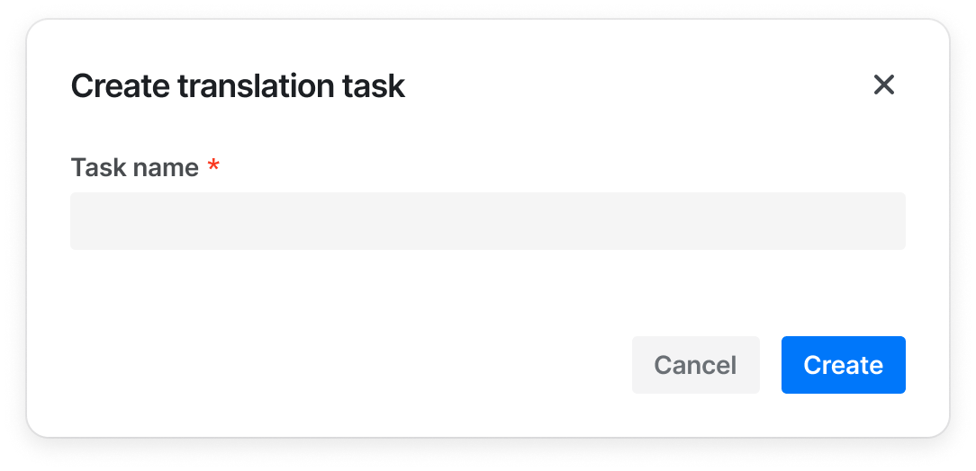
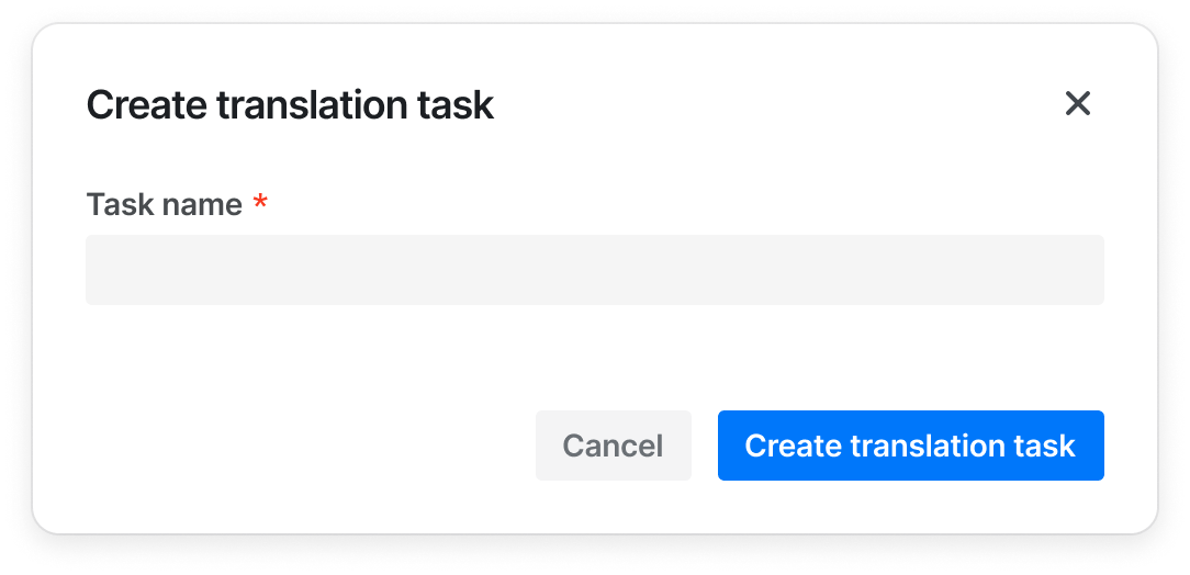
When the button is combined with other components, the button can only display {verb}, such as "Add", "Create", if the other components (such as Modal and Sidesheet) already provide enough context for the information ✅ Recommended usage ❌ Deprecated usage
Always write in Sentence case ✅ Recommended usage ❌ Deprecated usage Create project Create Edit profile Edit