输入类 · Form
表单
表单(Form)
- 按需重绘,避免了不必要的全量渲染, 性能更高
- 简单易用,结构极简,避免了不必要的层级嵌套
- 完善的无障碍支持
- 在 Form 外部可方便地获取 formState / fieldState
提供在外部对表单内部进行操作的方法:formApi / fieldApi - 支持将自定义组件封装成表单控件,你可以通过 Form 提供的扩展机制(withField HOC)快捷接入自己团队的组件
- 支持 Form level / Field level 级别的赋值、校验(同步/异步)
表单控件(Field)
Semi 将所有自带的输入控件(文本输入框、下拉选择、复选框、单选框等)都使用 withField 封装了一次。
接管了他们的数据流(value & onChange)
使用的时候,需要从 Form 中导出(注意:从 Form 导出的控件才具有数据同步功能)
使用的时候,需要从 Form 中导出(注意:从 Form 导出的控件才具有数据同步功能)
目前 Form 提供了如下表单控件
Input、InputNumber、TextArea、Select、Checkbox、Radio、RadioGroup、Switch、DatePicker、TimePicker、Slider、InputGroup、TreeSelect、Cascader、Rating、AutoComplete、Upload、Label、ErrorMessage、Section、TagInput都挂载在 Form 下,使用时直接以<Form.Input> 、<Form.Select>声明即可
Form 提供的 Field 级别组件,它的 value(或者 valueKey 指定的其他属性)、onChange(或 onKeyChangeFnName 指定的其他回调函数)
属性都会被 Form 劫持,所以
注意事项
- 你不需要也不应该用 onChange 来作同步,当然你可以继续监听 onChange 事件获取最新的值
- 你不能再用控件的
value、defaultValue、checked、defaultChecked等属性来设置表单控件的值,默认值可以通过 Field 的initValue或者 Form 的initValues设置 - 你不应该直接修改 FormState 的值,所有对 Form 内数据的修改都应该通过提供的 formApi、fieldApi 来完成
代码演示
声明表单的多种写法
Semi Form 同时支持多种写法
基本写法
从 Form 中导出表单控件,给表单控件添加
还可以给每个表单控件设置
field属性,将其放置于 Form 内部即可还可以给每个表单控件设置
label属性,不传入时默认与 field 相同label可以直接传入字符串,亦可以以 object 方式声明,配置 extra、required、optional等属性应对更复杂的场景 注意事项
对于Field级别组件来说,field 属性是必填项!
支持的其他写法
当你需要在 Form 结构内部直接获取到
formState、formApi、values 等值时,你还可以使用以下的写法注意事项
注意,此处获取的 formState、values 等并没有经过 deepClone。你应该只做读操作,而不应该做写操作,否则会导致你可能意外修改了form内部的状态。所有对 Form 内部状态的更新都应该通过 formApi 去操作
通过 render 属性传入
即 render props
通过 child render function
Form 的 children 是一个 function,return 出所有表单控件
通过 props.component
通过 component 属性直接将整个内部结构以 ReactNode 形式传入
已支持的表单控件
表单控件值的绑定
每个表单控件都需要以
字段可以是简单的字符串,可以是包含
下面是字段名称以及他们在 FormState 中的映射路径的示例
field属性绑定一个字段名称,用于将表单项的值正确映射到FormState values / errors / touched 中字段可以是简单的字符串,可以是包含
.或者[]的字符串, 支持多级嵌套下面是字段名称以及他们在 FormState 中的映射路径的示例
| Field | Resolution |
|---|---|
| username | formState.values.username |
| user[0] | formState.values.user[0] |
| siblings.1 | formState.values.siblings[1] |
| siblings['2'] | formState.values.siblings[2] |
| parents[0].name | formState.values.parents[0].name |
| parents[1]['name'] | formState.values.parents[1].name |
表单布局
- 垂直布局:表单控件之间上下垂直排列(默认)
Semi Design 更推荐表单采用垂直布局
- 水平布局:表单控件之间水平排列
你可以通过设置
layout='horizontal'来使用水平布局
- labelPosition、labelAlign
你可以通过设置 labelPosition、labelAlign 控制 label 在 Field 中出现的位置,文本对齐的方向
- 更复杂的布局 你还可以结合 Grid 提供的 Row、Col,来对表单进行你想要的排列
表单分组
字段数量较多的表单应考虑对字段进行分组,可以使用
Form.Section对 Fields 进行分组(仅影响布局,不会影响数据结构)wrapperCol / labelCol
需要为 Form 内的所有 Field 设置统一的布局时,可以在 Form 上设置 wrapperCol 、labelCol 快速生成布局,无需手动使用 Row、Col 手动布局
wrapperCol、labelCol属性配置参考Col 组件隐藏Label
Form 会自动为 Field 控件插入 Label。如果你不需要自动插入 Label 模块, 可以通过在 Field 中设置
如果你希望与原始控件保持 DOM 结构一致,可以使用 pure=true,此时除了数据流被接管外,DOM结构不会有任何变化(你需要自行负责 ErrorMessage的渲染,同时它也无法被 formProps.wrapperCol 属性影响)
noLabel=true将自动插入 Label 功能关闭(此时 Field 仍然具备自动展示 ErrorMessage 的能力,因此 DOM 结构与原始控件依然会有区别)如果你希望与原始控件保持 DOM 结构一致,可以使用 pure=true,此时除了数据流被接管外,DOM结构不会有任何变化(你需要自行负责 ErrorMessage的渲染,同时它也无法被 formProps.wrapperCol 属性影响)
内嵌 Label
通过将 labelPosition 设为
inset,可以将 Label 内嵌在表单控件中。目前支持这项功能的组件有Input、InputNumber、DatePicker、TimePicker、Select、TreeSelect、Cascader、TagInput导出 Label、ErrorMessage 使用
如果你需要 Form.Label、Form.ErrorMessage 模块自行组合使用,可以从 Form 中导出
- Label 的 API 详见 Label
- ErrorMessage 的 API 详见 ErrorMessage
例如:当自带的 Label、ErrorMessage 布局不满足业务需求,需要自行组合位置,但又希望能直接使用 Label、ErrorMessage 的默认样式时
使用 Form.Slot 放置自定义组件
当你的自定义组件,需要与 Field 组件保持同样的布局样式时,你可以通过 Form.Slot 放置你的自定义组件
在 Form 组件上设置的
Slot 属性配置详见Form.Slot
在 Form 组件上设置的
labelWidth、labelAlign、wrapperCol、labelCol 会自动作用在 Form.Slot 上Slot 属性配置详见Form.Slot
使用 helpText、extraText 放置提示信息
可以通过
可以通过
当传入 validateStatus 时,优先展示 validateStatus 值对应的 UI 样式。不传入时,以 field 内部校验状态为准。
helpText放置自定义提示信息,与校验信息(error)公用同一区块展示,两者均有值时,优先展示校验信息。可以通过
extraText放置额外的提示信息,当需要错误信息和提示文案同时出现时,可以使用这个配置,常显,位于 helpText/error 后当传入 validateStatus 时,优先展示 validateStatus 值对应的 UI 样式。不传入时,以 field 内部校验状态为准。
通过配置
例如如当你希望将 extraText 提示信息显示在 Label 与 Field 控件中间时
该属性可在 Form 上统一配置,亦可在每个 Field 上单独配置,同时传入时,以 Field 的配置为准。
extraTextPosition,你可以控制 extraText 的显示位置。可选值 bottom、middle例如如当你希望将 extraText 提示信息显示在 Label 与 Field 控件中间时
该属性可在 Form 上统一配置,亦可在每个 Field 上单独配置,同时传入时,以 Field 的配置为准。
使用 InputGroup 组合多个 Field
当你需要将一些表单控件组合起来使用时,你可以用
当你给
而在
Form.InputGroup将其包裹起来当你给
Select、Input等表单控件加上 field 属性时,Form会默认给每个 Field 控件自动插入Label而在
InputGroup中一般仅需要一个属于整个 Group 的 Label,你可以在 InputGroup 中设置 label 属性,插入一个属于 Group 的Labellabel可配置属性详见Label Modal 弹出层中的表单
你可以将 Form 放置于 Modal 中,以弹窗形式承载
在提交时,通过 formApi.validate()对 Field 进行集中校验
在提交时,通过 formApi.validate()对 Field 进行集中校验
配置初始值与校验规则
- 你可以通过
rules为每个 Field 表单控件配置校验规则
Form 内部的校验库基于 async-validator,更多配置规则可查阅其官方文档 - 你可以通过 form 的
initValues为整个表单统一设置初始值,也可以在每个 field 中通过initValue设置初始值(后者优先级更高) - 可以通过 trigger 为每个 Field 配置不同的校验触发时机,默认为 change(即onChange触发时,自动进行校验)。还支持 change、blur、mount、custom 或以上的组合。v2.42 后支持通过 FormProps 统一配置, 若都配置时,以 FieldProps 为准
- 可以通过 stopValidateWithError 开关,决定使用 rules 校验时,当碰到第一个检验不通过的 rules 后,是否继续触发后续 rules 的校验。v2.42 后支持通过 FormProps 统一配置,若都配置时,以 FieldProps 为准
自定义校验(Form 级别)
你可以给
Form整体设置自定义校验函数。推荐使用 validator(validateFields 为旧写法,仍保持兼容)。submit 或调用 formApi.validate() 时会进行调用注意
当配置了 Form 级别校验器(validator / validateFields)后,Field 级别的校验器(fieldProps.validator / fieldProps.validate、fieldProps.rules 将不再生效)
同步校验
校验通过时,你应该返回一个空字符串;
校验失败时,你应该返回错误信息(Object,key 为 fieldName,value 为对应的错误信息)
校验失败时,你应该返回错误信息(Object,key 为 fieldName,value 为对应的错误信息)
异步校验
异步校验时,你应当返回一个 promise,在 promise.then()中 你需要 return 对应的错误信息
自定义校验(Field 级别)
你可以指定单个表单控件的自定义校验函数,推荐使用
validator(validate 为旧写法,仍保持兼容)。支持同步、异步校验(通过返回 promise)关于 validator 与 rules[].validator
Field 上的
validator(本次新增)和 rules[] 数组里的 validator(基于 async-validator)是两个不同的 API:- Field
validator:签名为(fieldValue, values) => string | Promise<string>,整字段级别的自定义校验,返回错误信息字符串。 rules[].validator:签名为(rule, value, callback) => void | Promise<void>,基于 async-validator 的单条规则级校验,由 callback 或 reject 上报错误。
两者互斥:只要设置了 Field 的
validator(或旧的 validate),rules 就不会再被触发。如果只需要简单的整字段自定义判断,建议使用 Field validator;如果需要多条规则、复用 async-validator 内置规则(如 required / type / pattern),请使用 rules。手动触发指定 Field 校验
当你希望手动触发某些特定 Field 的校验操作时,可以通过 formApi.validate 完成。不传入参数时,默认对全部 Field 进行校验,传入参数时,以参数指定为准
静默校验
当你需要获取校验结果但不想触发 UI 更新时(如不显示错误提示、不设置 touched 状态),可以通过
formApi.validate({ silent: true }) 实现。这在根据校验结果决定是否发起后端请求等场景中非常有用。表单联动
你可以通过监听 Field 的 onChange 事件,然后使用 formApi 进行相关修改,来使 Field 之间达到联动
动态表单
动态删减表单项
动态表单保留状态(keepState)
默认情况下,当 Field 组件卸载后,其对应的值(value)、校验信息(error)、交互状态(touched)都会被重置。如果你希望 Field 卸载后保留这些状态(例如在条件渲染的场景中),可以使用
keepState 属性。在上面的示例中:
- 设置了
keepState的字段在隐藏再显示后,之前输入的值、校验状态等会被保留 - 未设置
keepState的字段在隐藏再显示后,状态会被重置
注意事项
keepState仅适用于「条件渲染卸载/重挂」的场景,并以 field 字段路径作为恢复依据。- 在
ArrayField内部的 Field 不支持keepState:调用remove(i)会让后续行的字段路径整体前移(例如people[1].name变为people[0].name),按路径恢复的语义不再匹配,容易出现已被删除的状态被「复活」等问题。 - 在
ArrayField中传入keepState将被忽略并打印 warning,请通过ArrayField自身的add、remove、addWithInitValue管理数组项。
使用 ArrayField
针对动态增删的数组类表单项,我们提供了 ArrayField 作用域来简化 add/remove 的操作
ArrayField 自带了 add、remove、addWithInitValue 等 api 用来执行新增行,删除行,新增带有初始值的行等操作
ArrayField 详细的 API请查阅下方 ArrayField Props 注意:ArrayField 的 initValue 类型必须是数组
ArrayField 自带了 add、remove、addWithInitValue 等 api 用来执行新增行,删除行,新增带有初始值的行等操作
ArrayField 详细的 API请查阅下方 ArrayField Props 注意:ArrayField 的 initValue 类型必须是数组
嵌套 ArrayField
ArrayField 支持多级嵌套,如下是一个两级嵌套的例子
Hooks 的使用
我们提供了四个 Hooks,使你在不需要通过 props 传递的情况下,也能在放置于 Form 结构内部的 Functional Component 中也能轻易访问到 Form 内部状态数据,以及调用 Form、Field 的相关 api
useFormApi
useFormApi 允许你通过 hook,在 Functional Component 内直接访问父级 Form 组件的 formApi
useFormState
useFormState 允许你通过 hook,在 Functional Component 内直接访问父级 Form 组件的 formState
useFieldApi
useFieldApi 允许你通过 hook,在 Functional Component 内直接调用指定 Field 的 api
useFieldState
useFieldState 允许你通过 hook,在 Functional Component 内直接访问指定 Field 的 State
HOC 的使用
我们提供了两个 HOC:
withFormApi、withFormState,可以在其他组件内部访问到 Form 的 formApi 以及内部状态 formState
提供了 HOC: withField,用于将自定义组件封装成符合 Semi Form 数据流的表单控件HOC-withFormApi
你可以通过 withFormApi HOC 来封装组件,使得该组件内部可以直接调用父级 Form 组件的 formApi
注意封装后的组件必须放置于 Form 结构内部
注意封装后的组件必须放置于 Form 结构内部
HOC-withFormState
你可以通过 withFormState HOC 来封装组件,使得该组件内部可直接访问到父级 Form 组件的 FormState
注意封装后的组件必须放置于 Form 结构内部 (因其强依赖 Context 机制进行消费)
注意封装后的组件必须放置于 Form 结构内部 (因其强依赖 Context 机制进行消费)
withField 封装自定义表单控件
通过 withField,你可以将其他自定义组件扩展成为表单控件,由 Form 接管其行为
注意
自定义组件必须为受控组件,只有受控组件,才能被 Form 接管,正确地进行值的更新
withField 主要做了以下事情
- 负责接管组件的 value(或者 valueKey 指定的其他属性)、onChange(或 onKeyChangeFnName 指定的其他回调函数)
- 负责在表单控件上方插入 Field 的
<Form.Label> - 负责在表单控件下方插入 Field 的
<ErrorMessage> - 负责在表单控件下方插入 Field 的 extraText
withFieldOption 具体配置可参考 withField Option
你的自定义受控组件需要做以下事情:
- 值发生变化时,调用props.onChange (或 onKeyChangeFnName 指定的其他回调函数) 并且将最新的值作为入参
- 响应props.value(或者 valueKey 指定的其他属性)的变化,并更新你的组件UI渲染结果
API 参考
Form Props
| 属性 | 说明 | 类型 | 默认值 |
|---|---|---|---|
| autoScrollToError | 若为 true,submit 或者调用 formApi.validate()校验失败时,将会自动滚动至出错的字段。object 型配置参考options | boolean| object | false |
| allowEmpty | 是否保留values中为空值的field的key,true时保留key,false时移除key | boolean | false |
| className | form 标签的 classname | string | |
| component | 用于声明表单控件,不可与 render、props.children 同时使用 | ReactNode | |
| disabled | 统一应用在每个 Field 的 disabled 属性 | boolean | false |
| extraTextPosition | 统一应用在每个 Field 上的extraTextPosition属性,控制extraText的显示位置,可选middle(垂直方向以Label、extraText、Field主体的顺序显示)、bottom (垂直方向以Label、Field主体、extraText的顺序显示) | string | 'bottom' |
| getFormApi | form mounted 时会回调该函数,将 formAPI 作为参数传入。formApi 可用于修改 form 内部状态(值、校验状态、错误信息) | function(formApi:object) | |
| form | 外部传入的 formApi 实例,可通过 Form.useForm() 创建。用于在 Form 外部控制表单状态。>=2.94.0 | object | |
| initValues | 用于统一设置表单初始值(仅会在组件挂载时消费一次),例如{fieldA:'hello', fieldB:['arr1', 'arr2']} | object | |
| layout | Form 表单控件间的布局,目前支持水平(horizontal)、垂直(vertical)两种 | string | 'vertical' |
| labelAlign | 统一配置label 的 text-align 值 | string | 'left' |
| labelCol | 统一应用在每个 Field 的 label 标签布局,同Col 组件,设置span、offset值,如{span: 6, offset: 2} | object | |
| labelPosition | 统一配置Field 中 label 的位置,可选'top'、'left'、'inset'(inset 标签内嵌仅部分组件支持) | string | 'top' |
| labelWidth | 统一配置label 宽度 | string|number | |
| onChange | form 更新时触发,包括表单控件挂载/卸载/值变更/blur/验证状态变更/错误提示变更, 入参为 formState | function(formState:object) | |
| onValueChange | form 的值被更新时触发,仅在表单控件值发生变化时触发。第一个入参为 formState.values,第二个入参为当前发生变化的 field | function(values:object, changedValue: object) | |
| onErrorChange | form 的校验状态被更新时触发。第一个入参为 formState.errors,第二个入参为当前发生变化的 field 的名称与校验结果(v2.66后提供) | function(values:object, changedError: object) | |
| onReset | 点击 reset 按钮或调用 formApi.reset()时的回调函数 | function() | |
| onSubmit | 点击 submit 按钮或调用 formApi.submitForm(),数据验证成功后的回调函数 | function(values:object, e: event) | |
| onSubmitFail | 点击 submit 按钮或调用 formApi.submitForm(),数据验证失败后的回调函数 | function(errors:object, values:object, e: event) | |
| render | 用于声明表单控件,不可与 component、props.children 同时使用 | function | |
| showValidateIcon | Field 内的校验信息区块否自动添加对应状态的 icon 展示 | boolean | true |
| style | 可将内联样式传入 form 标签 | object | |
| stopValidateWithError | 统一应用在每个 Field 的 stopValidateWithError,使用说明见 Field props中同名 API (v2.42后提供) | boolean | false |
| stopPropagation | 是否阻止 submit或reset事件冒泡,用于嵌套 Form 场景下,内部 Form submit或reset时阻止事件往外传播,触发外部Form的事件。默认为 { reset: false, submit: false }(v2.63后提供) | object | |
| trigger | 统一应用在每个 Field 的 trigger,使用说明详见 Field props中同名 API(v2.42后提供) | string|array | 'change' |
| validator | Form 级别的自定义校验函数(推荐,v2.97.0 后提供),submit 时或 formApi.validate 时会被调用(配置 Form 级别校验器后,Field 级别校验器在 submit 或 formApi.validate() 时不会再被触发)。支持同步校验、异步校验 | function(values) | |
| validateFields | Form 级别的自定义校验函数(已废弃,建议使用 validator;仍保持兼容)。submit 时或 formApi.validate 时会被调用(配置 Form 级别校验器后,Field 级别校验器在 submit 或 formApi.validate() 时不会再被触发)。支持同步校验、异步校验 | function(values) | |
| wrapperCol | 统一应用在每个 Field 上的布局,同Col 组件,设置span、offset值,如{span: 20, offset: 4} | object |
FormState
FormState 存储了所有 Form 内部的状态值,包括各表单控件的值,错误信息、touched 状态
进行表单提交时,实际提交的就是 formState.values
进行表单提交时,实际提交的就是 formState.values
| Name | 说明 | 初始值 | 示例 |
|---|---|---|---|
| values | 表单的值 | {} | { fieldA: 'str', fieldB: true } |
| errors | 表单错误信息集合,你可以通过判断是否有错误信息来决定是否允许用户提交 | {} | { fieldA: 'length not valid'} |
| touched | 用户点击过的 field 集合 | {} | { fieldA: true } |
如何访问 formState
- 通过调用 formApi.getFormState(),在 Form 外部也可以获取 formState
- 通过 child render function 方式声明表单,formState 会作为参数注入
- 通过 render props 方式声明表单,formState 会作为参数注入
- 通过 useFormState hook,Functional Component 访问父级 Form 的 formState,无需繁琐的引用传递
- 通过 withFormState HOC
FormApi
我们提供了 FormApi。你在 Form 内部、外部都可以很方便地获取到 formApi,它允许你使用 getter 和 setter 来获取和操作 formState 的值。
下面的表格描述了 formApi 中可用的功能。
下面的表格描述了 formApi 中可用的功能。
关于作用域隔离
为了防止用户在读取 formState、values 等内部状态后,意外操作直接了修改 Form 组件的内部状态等情况,Semi 对于 formApi.setValue、setValues的入参、formApi.getFormState、getValue、getValues的返回结果都会自动进行 deepClone
| Function | 说明 | example |
|---|---|---|
| getFormProps | 获取 Form 组件上当前所有props的值,例如可用于读取 disabled 等。v 2.57.0 后提供 | formApi.getFormProps(propNames?: string[]) |
| getFormState | 获取 FormState | formApi.getFormState() |
| submitForm | 可手动触发 submit 提交操作 | formApi.submitForm() |
| reset | 可手动对 form 进行重置 | formApi.reset(fields?: Array <string>) |
| validate | 可手动触发对表单的校验,不传参时默认触发整全体Field的校验(配置Form级别校验器后,Field级别校验器在submit或formApi.validate()时不会再被触发),若想触发部分field的校验,将目标field数组传入即可 v2.94.0 版本后支持静默校验:传入 { silent: true } 可在不触发 UI 更新(不显示错误提示、不设置 touched 状态)的情况下获取校验结果,也可通过 { fields: ['fieldA'], silent: true } 对指定字段进行静默校验 | formApi.validate() .then(values=>{}) .catch(errors=>{}) 或 formApi.validate(['fieldA','fieldB']) 或 formApi.validate({ silent: true }) 或 formApi.validate({ fields: ['fieldA'], silent: true }) |
| setValues | 设置整个表单的值。第二个参数中的 isOverride 默认为 false isOverride 为 false 时:遍历 Form 中所有已注册的 field,从 newValues 中取对应字段的值更新到 formState.values 中。如果 newValues 中不包含某个已注册 field 的值,该字段会被设置为 undefined。isOverride 为 true 时:直接用 newValues 整体替换 formState.values,包括 newValues 中存在但表单中没有对应 field 的额外 key 也会写入。推荐用法:如果只需要更新部分字段,建议使用 formApi.setValue(field, value) 逐个更新,或者先获取当前值再合并:formApi.setValues({ ...formApi.getValues(), name: newValue }) | formApi.setValues(newValues: object, { isOverride: boolean }) |
| setValue | 提供直接修改 formState.values 方法,与 setValues 的区别是它仅修改单个 field | formApi.setValue(field: string, newFieldValue: any) |
| getValue | 获取 单个 Field 的值 | formApi.getValue() formApi.getValue(field: string) |
| getValues | 获取 所有 Field 的值 | formApi.getValues() |
| setTouched | 修改 formState.touched | formApi.setTouched(field: string, isTouched: boolean) |
| getTouched | 获取 Field 的 touched 状态 | formApi.getTouched(field: string) |
| setError | 修改 某个 field 的 error 信息 | formApi.setError(field: string, fieldErrorMessage: string) |
| getError | 获取 Field 的 error 状态 | formApi.getError(field: string) |
| getFieldExist | 获取 Form 中是否存在对应的 field | formApi.getFieldExist(field: string) |
| scrollToField | 滚动至指定的 field, 第二个入参将透传至scroll-into-view-if-needed | formApi.scrollToField(field: string, scrollOpts: ScrollIntoViewOptions) |
| scrollToError | 滚动至校验错误的field,可传指定 field 或者 index,传入 index 则滚动到第 index 个错误的 DOM,若不传参则滚动到DOM树中第一个校验出错的位置。 v2.61.0后提供 | formApi.scrollToError( ScrollToErrorOptions |
如何获取 formApi
- 通过
Form.useForm()在 Form 外部创建 formApi,然后通过 props.form 传入 Form 组件。这种方式允许你在 Form 渲染前就获取 formApi,适合需要在组件外部控制表单的场景。 - Form 组件在 ComponentDidMount 阶段,会执行 props 传入的 getFormApi 回调,你可以在回调函数中保存 formApi 的引用,以便后续进行调用(示例如下代码)
除此之外,我们还提供了其他方式获取 formApi,你可以根据喜好选择不同的调用方式 - 通过 ref 的方式获取 Form 组件实例,直接访问实例上的 formApi
- 通过 child render function 方式声明表单,formApi 会作为参数注入
- 通过 render props 方式声明表单,formApi 会作为参数注入
- 通过 useFormApi hook
- 通过 withFormApi HOC
使用 Form.useForm()
Form.useForm() 用于在 Form 组件外部创建 formApi 实例,适合需要在 Form 渲染前就控制表单的场景。它返回一个数组 [formApi, formState, formValues]。>=2.94.0Form.useForm() 与 useFormApi 的区别
- Form.useForm():在 Form 外部创建 formApi,需要通过 props.form 传入 Form 组件。用于父组件控制子 Form 的场景。
- useFormApi:在 Form 内部获取 formApi,用于 Form 的子组件访问父级 Form。详见 useFormApi。
使用示例:
注意事项
使用
Form.useForm() 创建的 formApi 在 Form 组件挂载前调用方法时,会在控制台输出警告。建议在 Form 挂载后再调用 formApi 的方法。Field Props
关于Field ref
v1.30.0之前的版本,Field组件并不会做ref转发
v1.30后可直接通过ref获取底层控件实例,例如给Form.Input、Form.Select指定ref,直接获取到底层原始Input、Select组件的ref引用
v1.30后可直接通过ref获取底层控件实例,例如给Form.Input、Form.Select指定ref,直接获取到底层原始Input、Select组件的ref引用
| 属性 | 说明 | 类型 | 默认值 |
|---|---|---|---|
| convert | field 值改变后,在 rerender 前,对 filed 的值进行二次更新 使用示例: (value) => newValue | function(fieldValue) | |
| field | 该表单控件的值在 formState.values 中的映射路径,Form 会使用该值来区分内部的表单控件 必填!!! 示例:Bindding Syntax | string | |
| label | 该表单控件的 label 标签文本,不传的时候默认与 field 同名, 传入 object 时会将其透传给 Form.Label,具体配置请参考Label | string|object | |
| labelPosition | 该表单控件的 label 位置,可选'top'/'left'/'inset'。在Form与Field上同时传入时,以Field props为准 | string | |
| labelAlign | 该表单控件的 label 文本的 text-align。在Form与Field上同时传入时,以Field props为准 | string | |
| labelWidth | 该表单控件的 label 文本的 width。在Form与Field上同时传入时,以Field props为准 | string|number | |
| noLabel | 当你不需要自动添加 label 时,可以将该值置为 true | boolean | |
| noErrorMessage | 当你不需要自动添加 ErrorMessage 模块时,可以将该值置为 true,注意此时 helpText 也不会被展示 | boolean | |
| name | 控件名称,传入时会自动在对应 field wrapper div 追加对应的 className,如:abc => '.semi-form-field-abc'。 v2.24 后,还会将 name 透传至底层组件消费,例如你可以用于配置 input的name属性 | string | |
| fieldClassName | 整个 fieldWrapper 的 className,作用与 name 参数一致,区别是不会自动追加前缀 | string | |
| fieldStyle | 整个 fieldWrapper 的 内联样式 | object | |
| initValue | 该表单控件的初始值(仅在 Field mounted 时消费一次,后续更新无效),相比 Form 的 initValues 中的值,它的优先级更高 | any(类型取决于当前组件,详细见各组件的 api) | |
| validator | 推荐(v2.97.0 后提供)。该表单控件的自定义校验函数。支持同步、异步校验(通过返回 promise)。 设置了 validator 时,rules 不会生效 使用示例:(fieldValue, values) => fieldValue >= 5 ? 'value not valid' : '' | function(fieldValue, values) | |
| validate | 已废弃(仍兼容)。请使用 validator 替代。该表单控件的自定义校验函数。支持同步、异步校验(通过返回 promise)。 设置了 validate 时,rules 不会生效 使用示例:(fieldValue, values) => fieldValue >= 5 ? 'value not valid' : '' | function(fieldValue, values) | |
| rules | 校验规则,校验库基于async-validator 使用示例:const rules=[{ required: true, message: 'can't be null ' }, { max: 10, message: 'can't more than 10 word' }] | array | |
| validateStatus | 该表单控件的校验结果状态(仅影响样式),可选值:success/error/warning/default | string | 'default' |
| trigger | 触发校验的时机,可选值:blur/change/custom/mount,或以上值的组合['blur','change']1、设置为 custom 时,仅会由 formApi/fieldApi 触发校验时被触发 2、mount(挂载时即触发一次校验) | string/array | 'change' |
| onChange | 值变化时触发的回调。v2.99.0+:回调函数的最后一个参数为最新的表单值 latestValues,可用于解决 React 闭包陷阱问题。使用示例: onChange={(value, e, ...other) => { const latestValues = other[other.length - 1]; }} | function(fieldValue: any | ev: { target: { value: any }}, ...args: any[], latestValues?: object) (具体参见各组件的 onChange 方法) | |
| onBlur | 失去焦点时触发的回调 | function() (具体参见各组件的 onBlur 方法) | |
| transform | 校验前转换字段值,转换后的值仅会在校验时被消费,对 formState 无影响 使用示例: (value) => Number | function(fieldValue) | |
| allowEmptyString | 是否允许值为空字符串。默认情况下值为''时,该 field 对应的 key 会从 values 中移除,如果你希望保留该 key,那么需要将 allowEmptyString 设为 true | boolean | false |
| keepState | 是否在 Field 卸载后保留其状态(value、error、touched)。为 true 时,Field 卸载后其值、校验信息、交互状态不会丢失,再次挂载时会自动恢复 | boolean | false |
| stopValidateWithError | 为 true 时,使用 rules 校验,碰到第一个检验不通过的 rules 后,将不再触发后续 rules 的校验 | boolean | false |
| helpText | 自定义提示信息,与校验信息公用同一区块展示,两者均有值时,优先展示校验信息 | ReactNode | |
| extraText | 额外的提示信息,当需要错误信息和提示文案同时出现时,可以使用这个,位于 helpText/errorMessage 后 | ReactNode | |
| pure | 是否仅接管数据流,为 true 时不会自动插入 ErrorMessage、Label、extraText 等模块,样式、DOM 结构与原始的组件保持一致 | boolean | false |
| extraTextPosition | 控制extraText的显示位置,可选middle(垂直方向以Label、extraText、Field主体的顺序显示)、bottom (垂直方向以Label、Field主体、extraText的顺序显示);在Form与Field上同时传入时,以Field props为准 | string | 'bottom' |
| ...other | 组件的其他可配置属性,与上面的属性平级一并传入即可,例如 Input 的 size/placeholder,Field 会将其透传至组件本身 |
ArrayField Props
针对动态增删的数组类表单项,我们提供了 ArrayField 作用域来简化 add/remove 的操作
| 属性 | 说明 | 类型 | 默认值 |
|---|---|---|---|
| field | 该表单控件的值在 formState.values 中的映射路径 必填,例如存在 ArrayField负责 a[0].name、a[1].name、a[2].name三行渲染,他们的父级为a,此处props.field应为 a | string | |
| initValue | ArrayField的初始值,如果同时在 formProps.initValues 与 arrayFieldProps.initValue 中都配置了初始值,后者优先级更高 | Array | [] |
| children | ArrayField的内容,类型为 Function,函数入参为 add、addWithInitValue 等操作函数 及 arrayFields,执行后应当返回 ReactNode | Function(ArrayFieldChildrenProps) => ReactNode |
Form.Section
| 属性 | 说明 | 类型 | 版本 |
|---|---|---|---|
| text | 段落标题 | ReactNode | - |
| className | 样式类名 | string | - |
| style | 内联样式 | object | - |
| children | 段落内容 | ReactNode | - |
Form.Label
默认情况下,Label 会由 Form 自行插入到每个 Field 中。如果你需要在其他地方自行插入 Label,我们提供了 Label 组件可以导出
| 属性 | 说明 | 类型 | 默认值 | 版本 |
|---|---|---|---|---|
| text | Label 内容 | ReactNode | ||
| required | 是否展示必填的*号 | boolean | false | |
| extra | 跟随在 required 后的内容 | ReactNode | - | |
| align | text-align | string | 'left' | |
| className | 样式类名 | string | ||
| style | 内联样式 | string | ||
| width | label 宽度 | number/string | ||
| optional | 是否自动在text后追加"(可选)"文字标识(根据Locale配置的不同语言自动切换相同语义文本)。当该项为true时,required的*号将不再展示。若当表单项多数均为必填时,仅强调可选项会更使得整体视觉更简洁 | boolean | false | v2.18.0 |
Form.InputGroup
| 属性 | 说明 | 类型 | 默认值 | 版本 |
|---|---|---|---|---|
| className | 样式类名 | string | ||
| style | 内联样式 | object | ||
| label | InputGroup 的 label 标签文本 | Label | string | ||
| labelPosition | 该表单控件的 label 位置,可选'top'/'left'/'inset'。在 Form 与 InputGroup 同时传入时,以 InputGroup props为准 | string | 'top' | |
| extraText | 额外的提示信息,当需要错误信息和提示文案同时出现时,可以使用这个,位于 errorMessage 后 | ReactNode | v2.29.0 | |
| extraTextPosition | 控制extraText的显示位置,可选middle(垂直方向以Label、extraText、Group的顺序显示)、bottom (垂直方向以Label、Group、extraText的顺序显示) | string | 'bottom' | v2.29.0 |
当 extraTextPositon 为 middle,且 labelPosition 为 left时。由于 extraText允许为 ReactNode,内容高度不定,Label将不再确保能与 Field / InputGroup 中的首行文本对齐。
Form.Slot
| 属性 | 说明 | 类型 |
|---|---|---|
| label | slot 的Label 配置, 例如{ text: 'semi', align: 'left' };也可以直接传入 string,Slot 内部会自动封装成合法 Label 格式 | object|string |
| labelPosition | slot 的 label 位置,默认情况下继承自 Form props,也可单独覆盖。可选'top'、'left' | string |
| className | slot 样式类名 | string |
| style | slot 内联样式 | object |
| children | slot 的主体内容 | ReactNode |
| error | slot 的错误提示信息 | ErrorMessage|ReactNode |
Form.ErrorMessage
- 当 error 为 ReactNode、String、Boolean 时,直接渲染
- 当 error 为数组时,会自动执行 join 操作聚合数组内的错误信息
| 属性 | 说明 | 类型 |
|---|---|---|
| error | 错误信息内容 | string|array|ReactNode|boolean |
| className | 样式类名 | string |
| style | 内联样式 | object |
| showValidateIcon | 是否自动加上 validateStatus 对应的 icon | boolean |
| validateStatus | 信息所属的校验状态,可选 default/error/warning/success(success一般建议与default样式相同) | string |
withFieldOption
| key | 描述 | 默认值 |
|---|---|---|
| valueKey | 组件表示值的属性,如 Switch、Radio 的是'checked',Input 的是'value' | 'value' |
| onKeyChangeFnName | 组件值变化时的回调函数,一般为'onChange' | 'onChange' |
| valuePath | 值属性在回调函数中第一个参数的路径,如 Radio 的 onChange(e.target.checked),那么该值需要设为 target.checkd;RadioGroup 的 onChange(e.target.value),该值为'target.value';若第一个参数就是值本身,无需再往下取值,该项不需要设 |
Accessibility
ARIA
- aria-labelledby、for
- Field 组件,会自动添加 label DOM。label 的
for属性与props.id或props.name或props.field相同 ;label 的id 属性由props.id或props.name或props.field决定,值格式为${props.field}-label; - 当 Form 或者 Field 的 props.labelPosition 设置为 inset时,此时不存在 label 标签,而是 div 标签。insetLabel 对应的 div 标签会被自动追加 id,值与上述 label 的 id 相同,对应 Field 组件的
aria-labelledby - Field 组件会被自动追加
aria-labelledby,值与上述 label 的id 相同
- Field 组件,会自动添加 label DOM。label 的
- aria-required
- 当 Field 配置了必填时(即 props.rules中包含 require: true 或 props.label配置了required: true),Field 组件会被自动追加 aria-required = true(Form.Switch、Form.CheckboxGroup 除外)
- aria-invalid 、aria-errormessage
- 当 Field 校验未通过时,Field 组件会被自动添加
aria-invalid= true 属性,Form.CheckboxGroup 除外。 - 当 Field 校验未通过时,Field 组件会被自动追加
aria-errormessage属性,值为 errorMessage 所对应DOM元素的 id (格式:${props.field}-errormessage),Form.CheckboxGroup 除外。
- 当 Field 校验未通过时,Field 组件会被自动添加
- aria-describedby
- 当 Field 配置了
helpText或extraText时,Field 组件会被自动添加aria-describedby属性,值为 helpText、extraText 所对应DOM元素的 id (格式:${props.field}-helpText、${props.field}-extraText)
- 当 Field 配置了
文案规范
- 表单标题
- 表单标题需要跟随标题的书写规范
- 表单标签
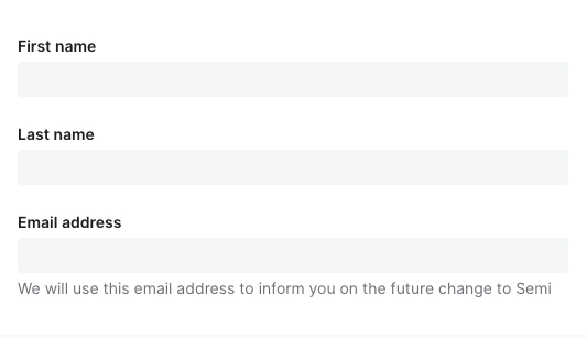
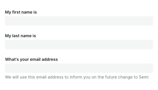
- 标签是输入框的简短描述。标签不是注释信息(help text),因此不应该是输入框的填写说明
- 标签必须要:
- 放在输入框的上方或下方
- 简短(1-3个词)
- 使用语句的大小写规范(首字母大写,其他小写)
- 帮助文本
- 帮助文本使用语句书写规范,首字母大写
- 表单按钮
- 关于表单按钮的文案规范,参考按钮Button组件的文案规范
| ✅ 推荐用法 | ❌ 不推荐用法 |
|---|---|
 |  |
设计变量
FAQ
- 为什么我声明了表单,对值进行了修改,数据没有自动映射到 formState.values 中?
请检查是否正确传入了 field,Field 上的field属性是必填项!!! - 为什么传入了 defaultValue、defaultChecked 不生效?
请参考文档开头表单控件,Form.Field 组件对默认值做了统一处理,你应该使用initValue或者initValues来传入默认值 - 为什么异步更新了 initValue、initValues 后,组件没有发生变化,值没有生效?
initValue、initValues只在 Field、Form mounted 时进行消费,后续做的异步更新并不会起效。
如果你的初始值需要从远程取,那么你可以在获取到值之后,使用formApi.setValue/setValues进行更新。
或者直接给 Form、Field 传入一个新的key强制它重新挂载 - 为什么调用了 formApi.setValues 更新 fields 的值,但是实际渲染并没有更新?setValues 默认情况下对尚未存在的 field 进行赋值不会生效。如果你的 fields 是动态加载的话,请检查在 setValues 时,该 field 是否已 mounted。
如有需要,可以使用 override 模式formApi.setValues(newValue, { isOverride: true }) - 为什么 rules 中的 validator 校验失败,但是对应的错误信息没有被展示?async-validator 的自定义 validator 返回值必须是 boolean 类型,否则它不执行任何回调,semi 后续的钩子也不会被调用。建议通过加 !! 或者 Boolean() 强制转换返回类型
- 为什么 getValues 拿不到某个 field?field 没有初始值的话,
getValues获取不到这一项。可以设置initValues/initValue或者给 form 设置allowEmpty属性。 - 为什么在输入框(Input、TagInput……)上敲击 enter 回车键会触发了 Form 的 submit?这个是标准 HTML 行为,我们不计划进行干预,会与原生保持一致。如果表单内确实只有一个 Input 元素,又不想回车时触发 submit 回调,建议对 Input 的 keydown 事件的 enter 采取 preventDefault 阻止默认行为。点击 #767 查看相关背景和内容。
- 表单会自动保存历史输入项,不想要这个功能怎么办?
在 v2.3 之前,Form 并没有严格按照 A11y 无障碍标准为输入控件配置for、name、id等属性,因此在之前的版本并没有该功能。v2.3 后我们严格按照 W3C 标准进行了实现。如果你不希望浏览器自动保存历史输入项,也可以通过在 Form 级别或者 Field 级别设置autoComplete=off关掉